4. Text Content
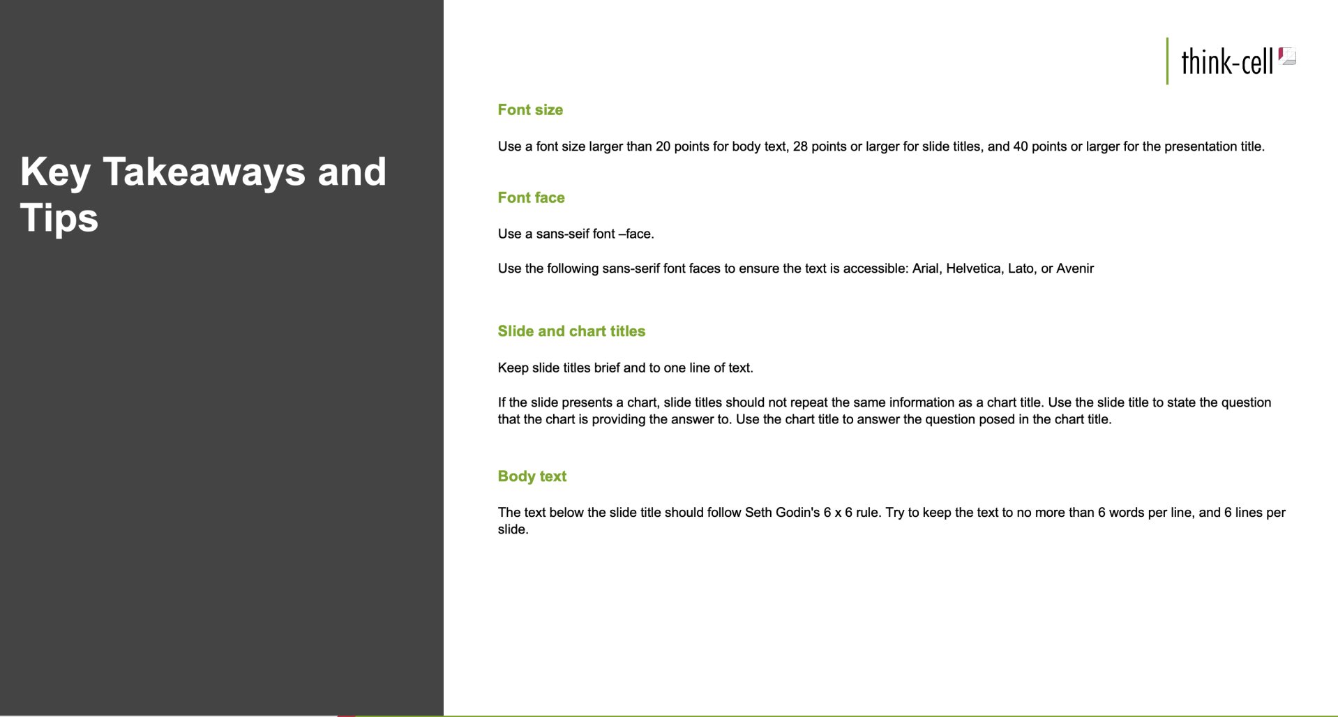
The slide in Figure 4.1 showcases several common pitfalls with text content.
- Slide title should be written in sentence case
- Slide titles run over one line of text
- Font size is 10.8 points for subheadings and 9.5 points for body text
- The content of the slides contains too much information
Figure 4.1: A slide with too much text and font size that is too small
There are a few simple design strategies that will help mitigate the pitfalls shown in Figure 4.1
Slide and chart titles
Keep slide titles brief and to one line of text. Titles should be written in sentence case. This improves the readability of the text. Avoid capitalizing each word of slide titles. For instance, instead of writing:
“Key Takeaways and Tips”,
Title the slide:
“Key takeaways and tips”.
If the slide presents a chart, slide titles should be action-oriented. With a slide title, the chart title may be unnecessary or redundant.
Body text content
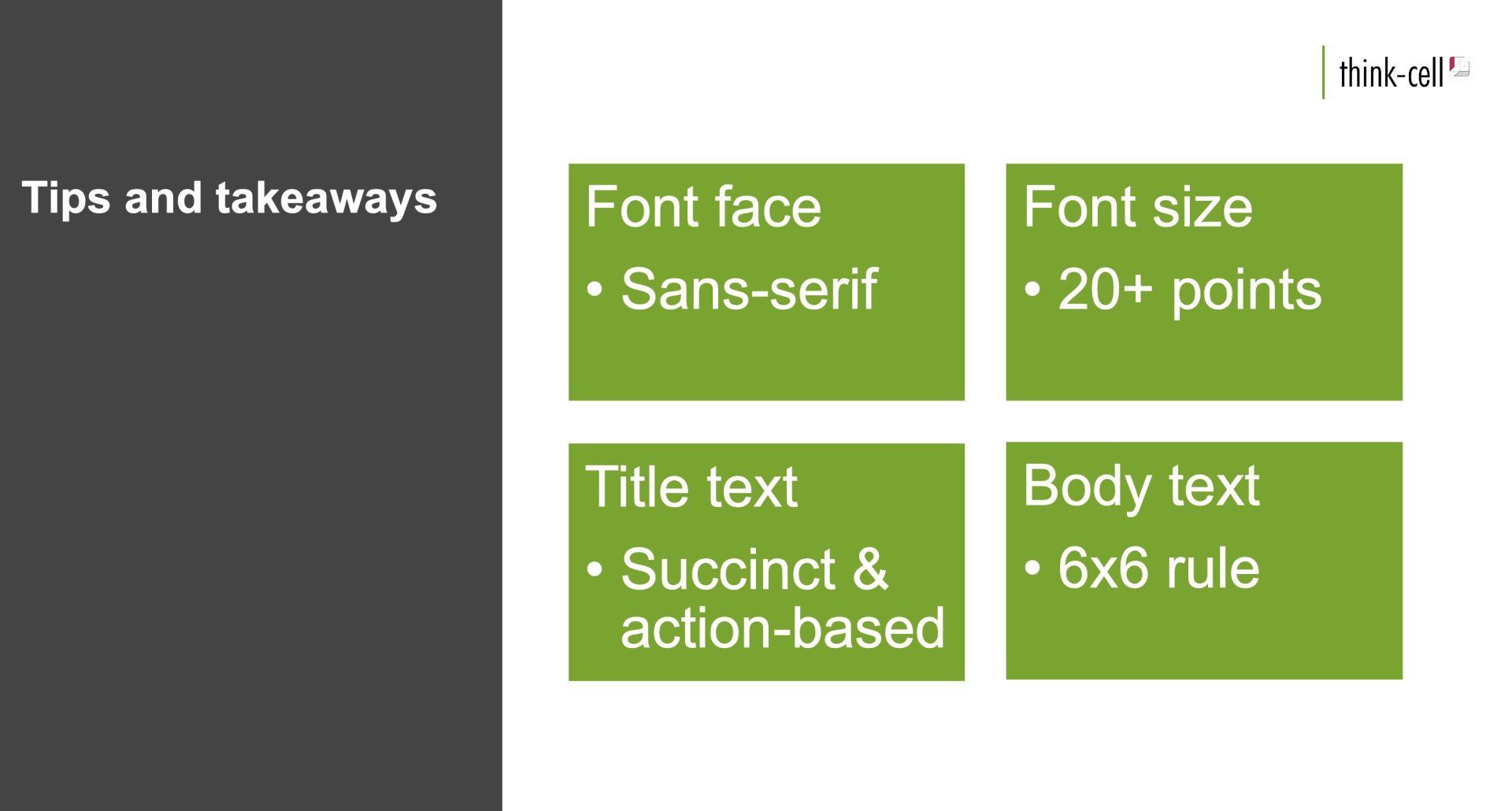
The text below the slide title should follow Seth Godin’s 6 x 6 rule. Keep the text to no more than six words per line and six lines per slide.
See Figure 4.2 for a redesigned version of Figure 4.1.
Figure 4.2: A well-designed slide that reduces the text shown on the screen
Module 1
-
About Design Principles
-
1Chart Format
-
2Color
-
3Text, Labels, and Legends
-
4Readability
-
Test Your Knowledge
-
5Scales
-
6Data Integrity
-
7Chart Junk
-
8Data Density
-
9Data Richness
-
10Attribution
-
Test Your Knowledge
-
Exercise 1: Build a Vertical Bar
-
Exercise 2: Build a Line Chart
-
Exercise 3: Build a Waterfall Chart

