Test Your Knowledge
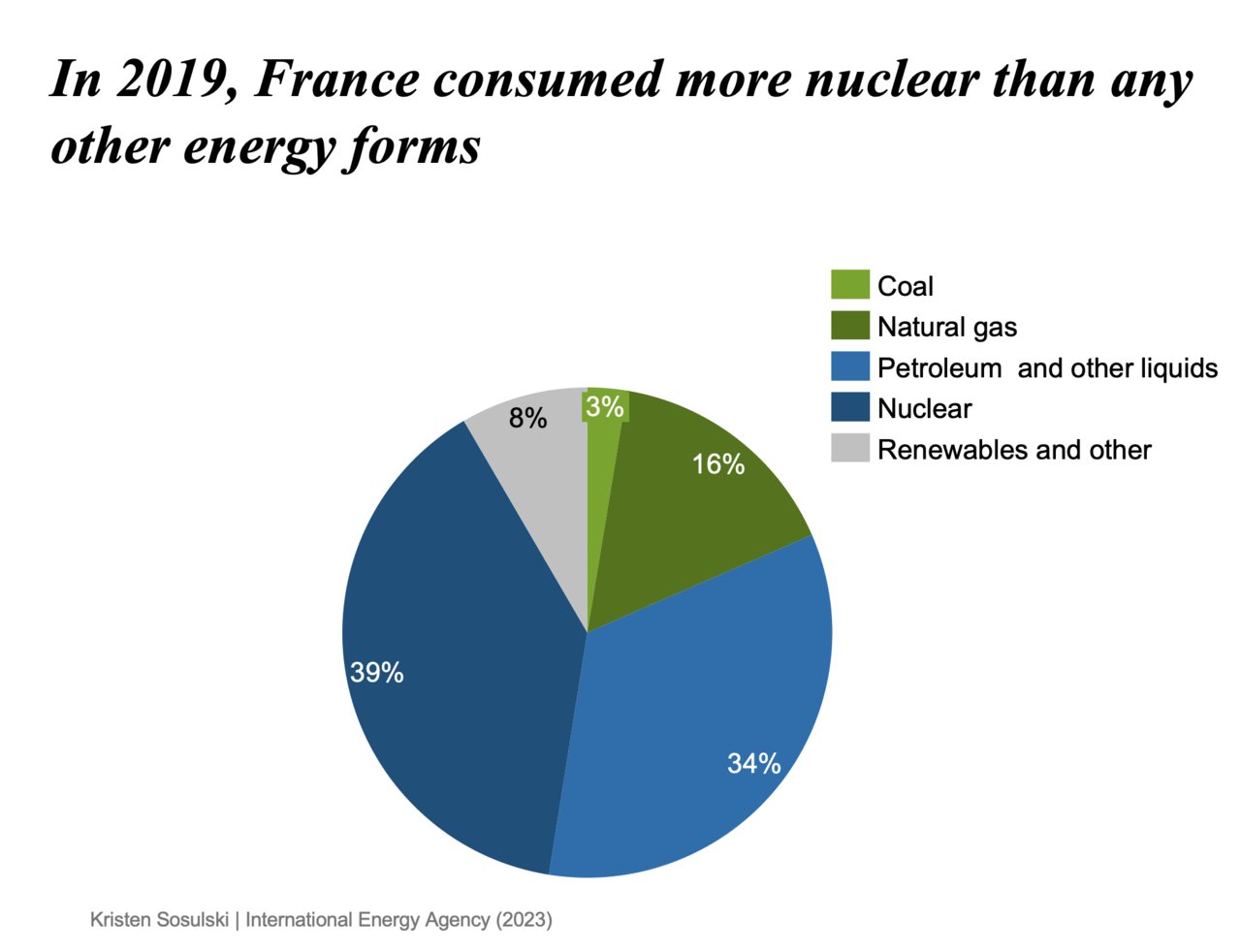
Test your knowledge of the design principles we discussed thus far, including chart type, color, text and labels, and readability. Take a look at the chart below and identify areas for improvement based on the design principles.
How could the design of this chart be improved? Select all that apply.
- Chart type
- Color
- Text and labels
- Readability
If you selected all of the options, you are correct.
The pie chart could be improved in the following areas:
- Chart type: A bar chart could better show this information.
- Color: The colors contrast needs improvement. Use the same color for each category and add white space between the wedges. When changing it to a bar chart, keep the bars the same color.
- Text and labels: Pie wedges could be directly labeled and the legend omitted. When changing the pie chart to a bar chart, the bars should be directly labeled.
- Readability: Omit italicized front from chart title.
- Readability: Change font face from a serif font to a sans-serif font such as Arial
Challenge yourself and fix the chart. Download the chart to get started.
Compare your revised chart with the solution. Download the solution.
Module 1
-
About Design Principles
-
1Chart Format
-
2Color
-
3Text, Labels, and Legends
-
4Readability
-
Test Your Knowledge
-
5Scales
-
6Data Integrity
-
7Chart Junk
-
8Data Density
-
9Data Richness
-
10Attribution
-
Test Your Knowledge
-
Exercise 1: Build a Vertical Bar
-
Exercise 2: Build a Line Chart
-
Exercise 3: Build a Waterfall Chart
