Exercise: Build a Presentation
Objective:
Create a presentation that compares the countries of Costa Rica and Panama using data from the “World Sustainability Dataset” on Kaggle. The data set tracked the sustainability of 173 countries over 19 years.
The presentation should contain six slides:
- A title slide with images
- A basic comparison of a few key economic indicators
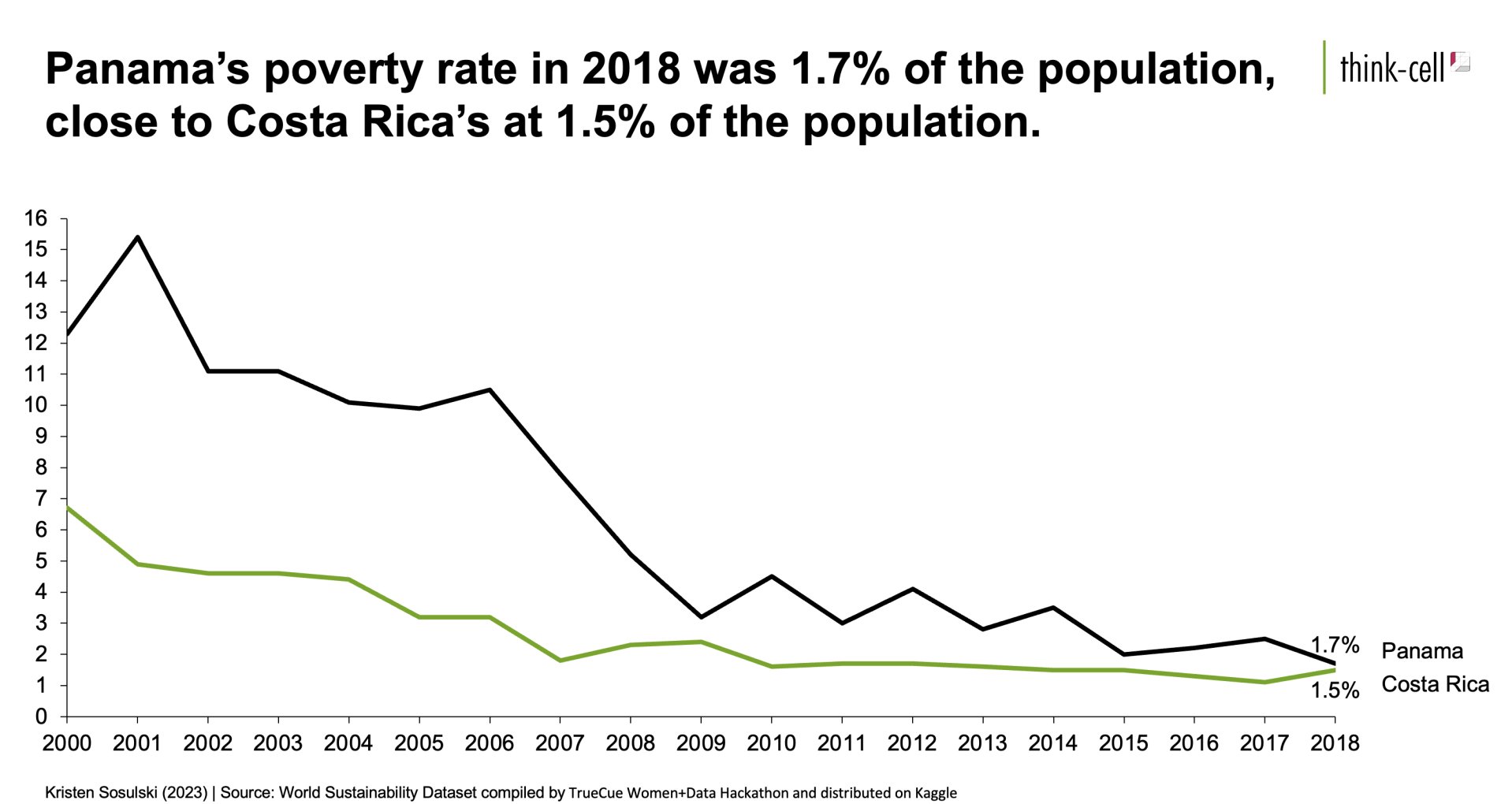
- A time series analysis of the declining poverty rate
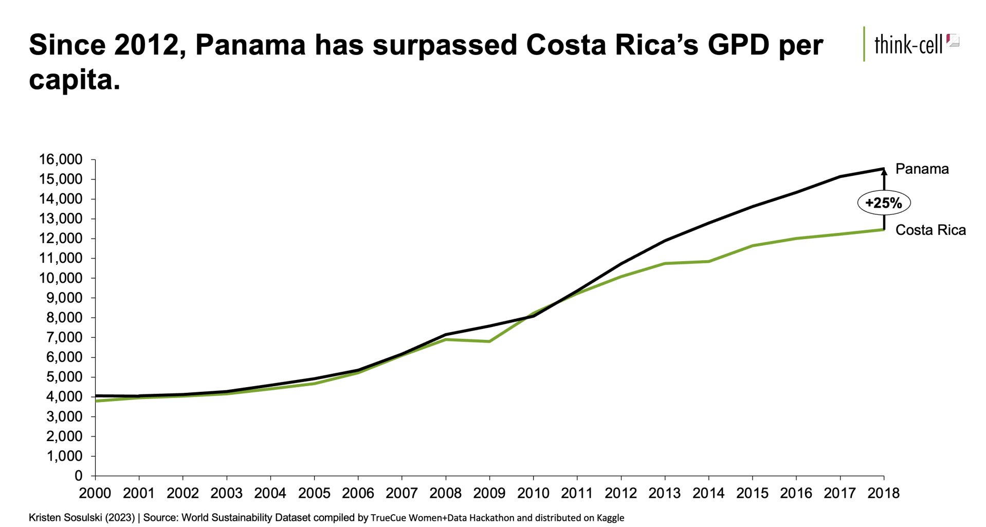
- A time series analysis of the changing GDP per capita
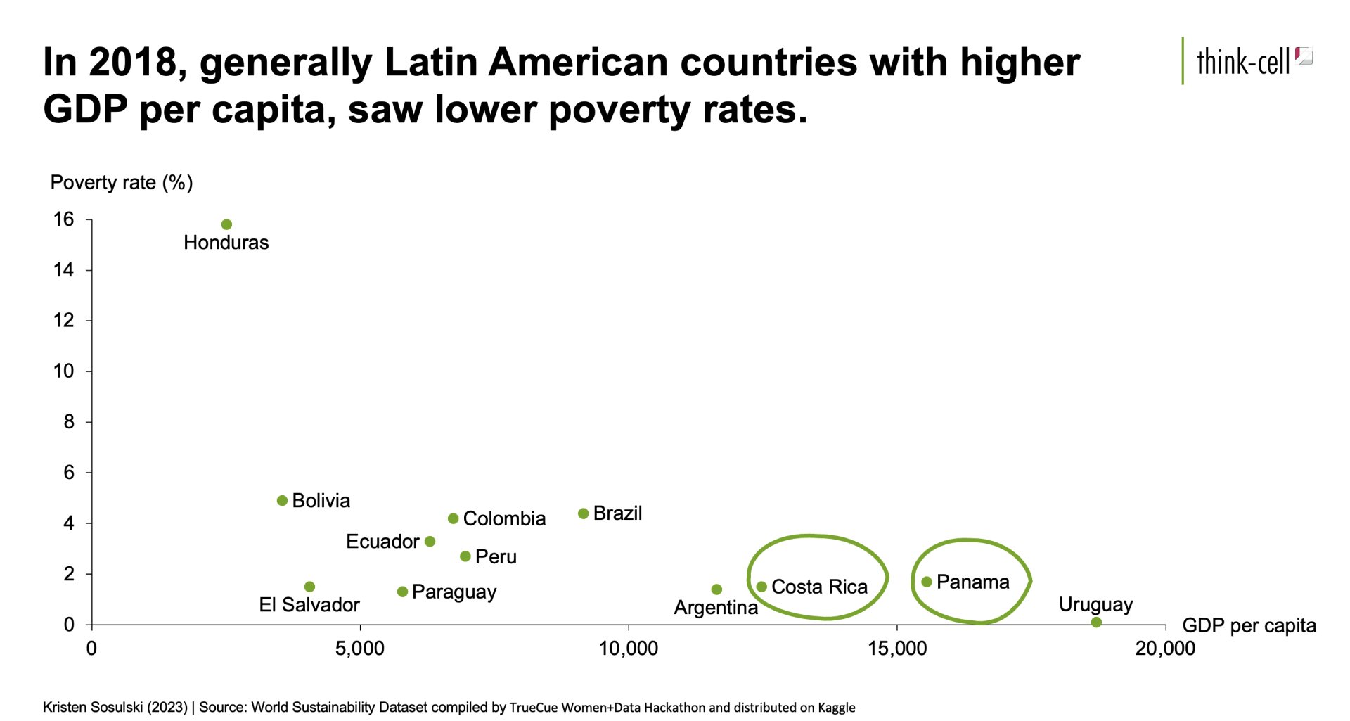
- A scatter plot that shows the relationship of GDP per capita compared to poverty rate for all Latin and South American countries that appear in the data set
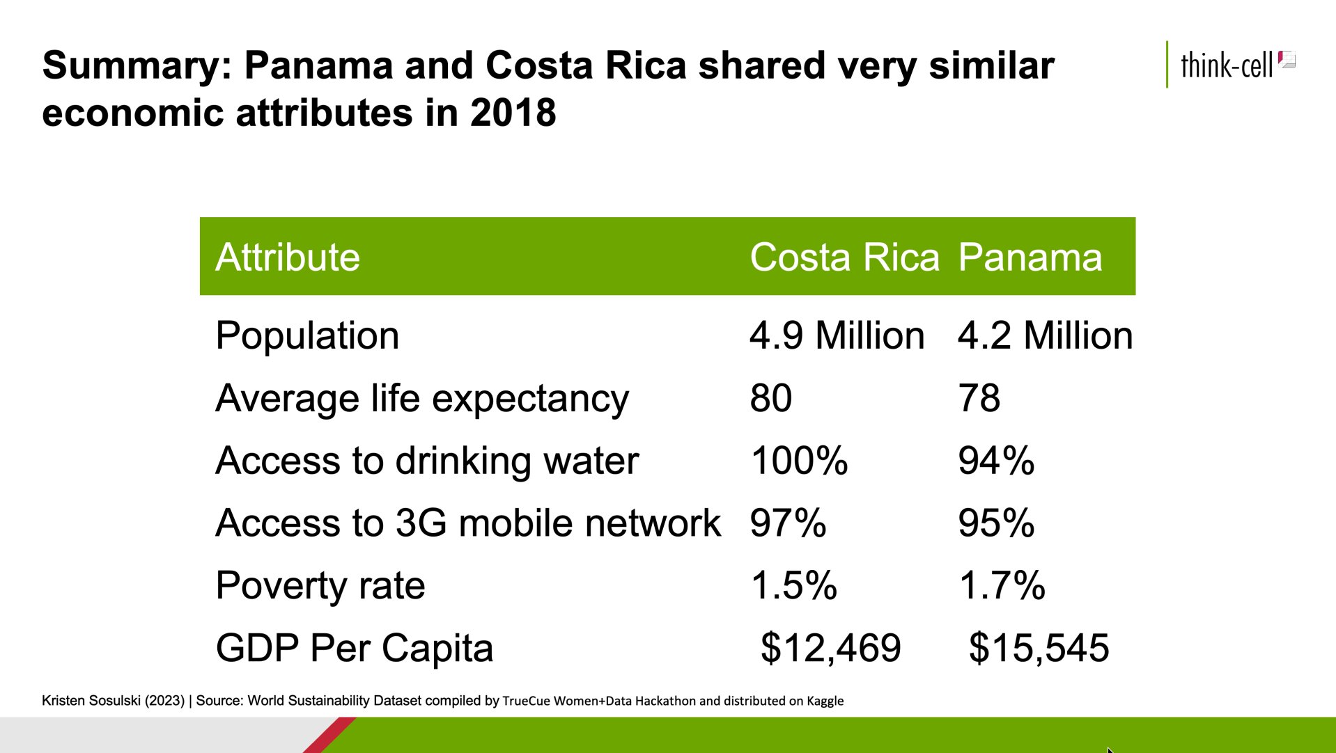
- A summary slide that includes the complete set of economic indicators for both Costa Rica and Panama
Follow along with Steps 1-7 to create a PowerPoint presentation that includes many think-cell elements such as charts, tables, and stock images.
STEP 1. Download and open the Excel data document.
- Please download the following Excel file. You will use this file to recreate the data slides, as shown in Steps 2-7 below.
- After you have downloaded the file, open it.
STEP 2. Create the title slide.
Refer to Figure 10.1 for an example.
- Begin by creating a new PowerPoint presentation
- Customize the color theme for your presentation
- Insert the presentation title slide and add the title: “Panama and Costa Rica”
- Add the following subtitle: An economic comparison of two Latin American Neighbors
- Insert an image of Central America using think-cell’s stock image tool
Figure 10.1: Slide 1.
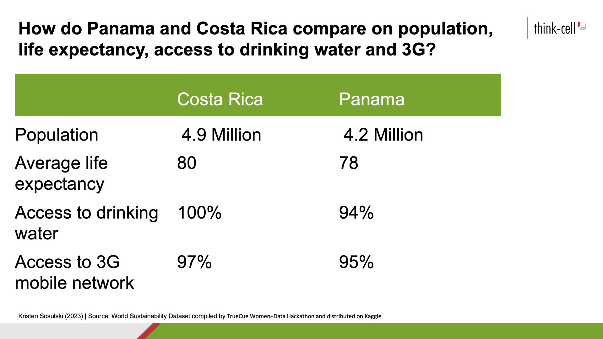
STEP 3. Create slide two that presents a table of economic data
Use the Excel sheet labeled Table 1 - Basic facts to build your table.
Refer to Figure 10.2 for an example.
- Insert slide 2 in your PowerPoint presentation
- Go the Excel sheet labeled Table 1 - Basic facts
- Highlight and copy cells A1:C5
- In PowerPoint, select Insert > Elements > Table
- Arrange your table on your PowerPoint slide
- Double-click on the table in PowerPoint to open the datasheet
- Replace the values in the data sheet with those you copied from Excel
- Adjust the width to be equal for all columns
- Increase the font size to 28 point
- Add a title
- Add attribution by including your name as the table author and the data source
Figure 10.2: Slide 2
STEP 4. Create slide three
Use the Excel sheet labeled Chart 1 - Poverty to build a line chart showing each country’s poverty rate variable from 2000 to 2019. This is the percentage of the population living on less than $1.90 a day at 2011 international prices.
Refer to Figure 10.3 for an example.
- Insert slide 3 in your PowerPoint presentation
- Go the Excel sheet labeled Chart 1 - Poverty
- Highlight and copy cells A1:U4
- In PowerPoint, select Insert > Elements > Line
- Double-click on the chart in PowerPoint to open the datasheet
- Replace the values in the data sheet with those you copied from Excel
- Arrange your line chart on your PowerPoint slide
- Thicken the line
- Add end-point labels
- Add a title
- Add a subtitle
- Add attribution by including your name as the chart author and the data source
Figure 10.3: Slide 3.
STEP 5. Create slide four
Use Excel sheet labeled Chart 2 - GDP Per Capita to build a line chart showing each country’s GDP per capita from 2000 through 2018.
Refer to Figure 10.4 for an example.
- Insert slide 4 in your PowerPoint presentation
- Go the Excel sheet labeled Chart 2 - GDP Per Capita
- Highlight and copy cells A1:U4
- In PowerPoint, select Insert > Elements > Line
- Arrange your line chart on your PowerPoint slide
- Double-click on the chart in PowerPoint to open the datasheet
- Replace the values in the data sheet with those you copied from Excel
- Thicken the line
- Add a Total Difference Arrow
- Add a title
- Add a subtitle
- Add attribution by including your name as the chart author and the data source
Figure 10.4: Slide 4.
STEP 6. Create slide five
Use the Excel sheet labeled Chart 3 - GDP & Poverty to build a line chart showing each country’s GDP per capita.
Refer to Figure 10.5 for an example.
- Insert slide 5 in your PowerPoint presentation
- Go the Excel sheet labeled Chart 3 - GDP & Poverty
- Highlight and copy cells A1:C14
- In PowerPoint, select Insert > Elements > Scatter/Bubble
- Arrange and resize the scatter plot on your PowerPoint slide
- Double-click on the chart in PowerPoint to open the datasheet
- Replace the values in the data sheet with those you copied from Excel
- Remove the outline around the scatter plot
- Add two animated circles to highlight Costa Rica and Panama
- Add a title
- Add a subtitle
- Add attribution by including your name as the chart author and the data source
Figure 10.5: Slide 5.
STEP 7. Create slide six
Create slide six that presents a summary table of economic data**
Use the Excel sheet labeled Table 2 - Summary to build your table.
Refer to Figure 10.6 for an example.
- Insert slide 6 in your PowerPoint presentation
- Go the Excel sheet labeled Table 2 - Summary
- Highlight and copy cells A1:C7
- In PowerPoint, select Insert > Elements > Table
- Double-click on the chart in PowerPoint to open the datasheet
- Replace the values in the data sheet with those you copied from Excel
- Arrange your table on your PowerPoint slide
- Add a title
- Add attribution by including your name as the table author and the data source
Figure 10.6: Slide 6.
Module 1
-
About Design Principles
-
1Chart Format
-
2Color
-
3Text, Labels, and Legends
-
4Readability
-
Test Your Knowledge
-
5Scales
-
6Data Integrity
-
7Chart Junk
-
8Data Density
-
9Data Richness
-
10Attribution
-
Test Your Knowledge
-
Exercise 1: Build a Vertical Bar
-
Exercise 2: Build a Line Chart
-
Exercise 3: Build a Waterfall Chart

