Exercise 3: Build a Waterfall Chart
In this exercise, we are going to create a waterfall chart.
What do you think waterfall charts are best used for? Answer the question below.
Waterfall charts are best for showing:
- specific locations
- discrete categories
- how a starting value becomes an ending value
If you selected the third option, you are correct. Waterfall charts can show a change from an initial value to an ending value. The values between the initial and ending value represent proportions of a category that contributes to the increase or reduction of the ending value.
Objective
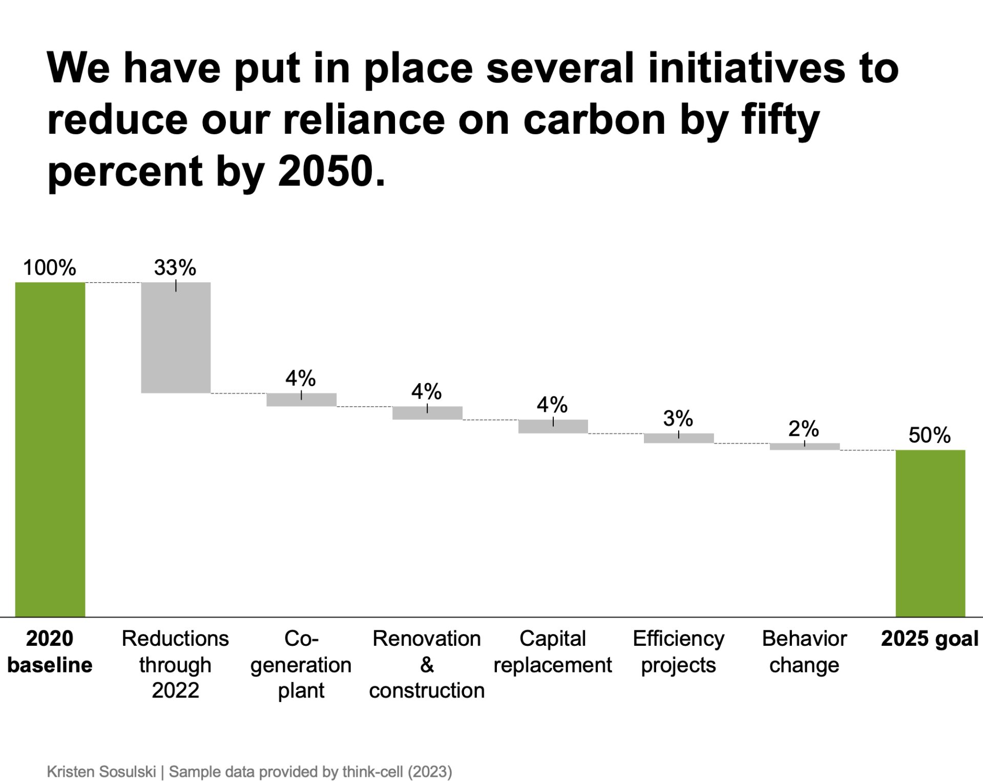
Create a chart that shows the inputs into carbon emissions reduction efforts. Use sample data from the worksheet.
- Recreate the following chart as shown in Figure 10.9
- Question: How can we reduce carbon emissions by fifty-percent?
- Chart type: think-cell waterfall column chart
Figure 10.9: A think-cell waterfall column chart
STEP 1. Download and open the Excel data document
-
Download the following Excel file. You will use this file to recreate Figure 10.9
-
After you have downloaded the file, open it
STEP 2. Create a waterfall column chart
- In the Excel file, navigate to sheet Waterfall chart and select and cells A1: I3
- In PowerPoint, go to the Insert > Elements menu, and choose Waterfall column9
- Next, PowerPoint will prompt you to select a place for the chart
- Double-click on the chart in PowerPoint to open the datasheet
- Replace the values in the data sheet with those you copied from Excel
STEP 3. Arrange, size, and format the chart elements
- Size the chart to fill the majority of the white space on the slide
- Move bar value labels to the top by selecting the value label and moving it above the bar
- Left-align the x-axis labels for each category by clicking on the 2020 baseline + SHIFT and then select 2025 goal, as shown in the video demonstration below
STEP 4. Format the value labels
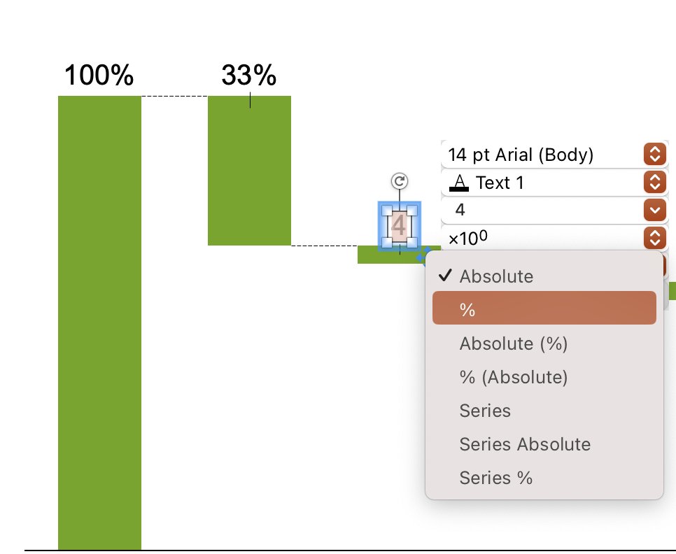
- Add percent signs to the value labels by clicking on the label to bring up the think-cell formatting window and select Absolute then %; see Figure 10.10
Figure 10.10: Formatting value labels as percentages in think-cell
STEP 5. Change the default color for the bars
- Bold the 2020 baseline and 2025 goal labels by clicking on the label and selecting the bold text tool
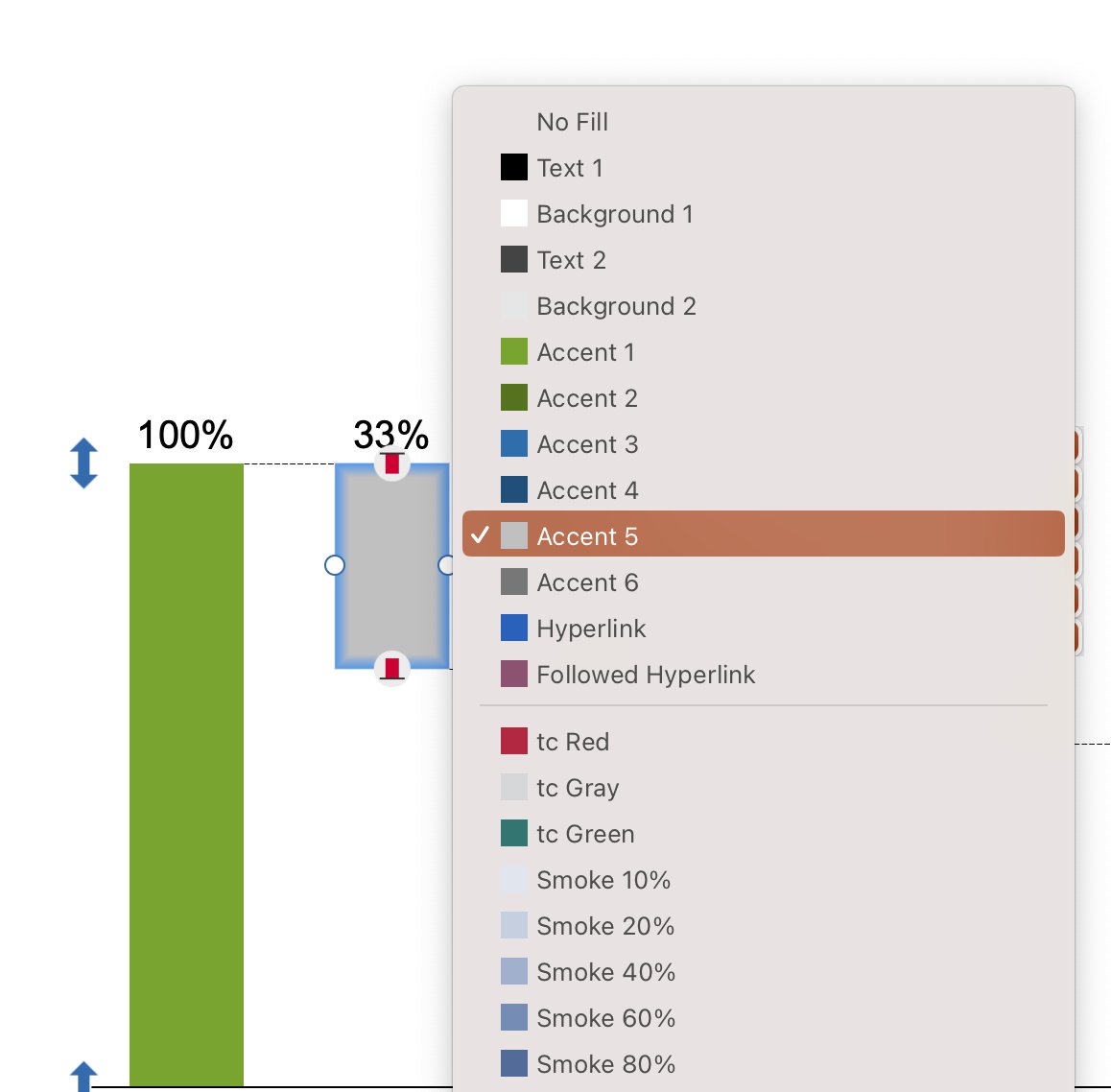
- Change the default color for the six bars between the 2020 baseline and 2025 goal bars by clicking on each bar and using the formatting menu to change the accent color to light gray; see Figure 10.11
Figure 10.11: Formatting value labels as percentages in think-cell
STEP 6. Title the chart
Title the chart with the action title: We have put in place several initiatives to reduce our reliance on carbon by fifty percent by 2050.
STEP 7. Add attribution
Add attribution at the bottom right or left of your chart. For example, include your name and the data source as: Your Name | Sample Data provided by think-cell (2023). Use the text tool in PowerPoint to insert a text box and type your text. Arrange the text so it appears at your chart’s lower right or left.
SUMMARY: A before and after
Review the video below to see the chart before the design principles were applied and after they were applied.
-
The alternative is to Insert > Waterfall column menu, and choose Clustered Bar from Excel. However, the prerequisite is that the Excel file is linked with the PowerPoint file.↩︎
Module 1
-
About Design Principles
-
1Chart Format
-
2Color
-
3Text, Labels, and Legends
-
4Readability
-
Test Your Knowledge
-
5Scales
-
6Data Integrity
-
7Chart Junk
-
8Data Density
-
9Data Richness
-
10Attribution
-
Test Your Knowledge
-
Exercise 1: Build a Vertical Bar
-
Exercise 2: Build a Line Chart
-
Exercise 3: Build a Waterfall Chart


