5. Layout
Select a slide layout that fits with your content. For charts and tables, select a layout that maximizes the area. The table or chart should take up at least 70 percent of the slide area; otherwise, it will likely be unreadable to the audience.
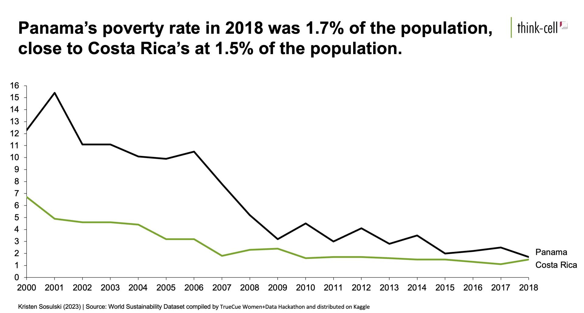
For example, look at Figure 5.1.
Figure 5.1: A slide with a single chart that fills the slide to maximize readability.
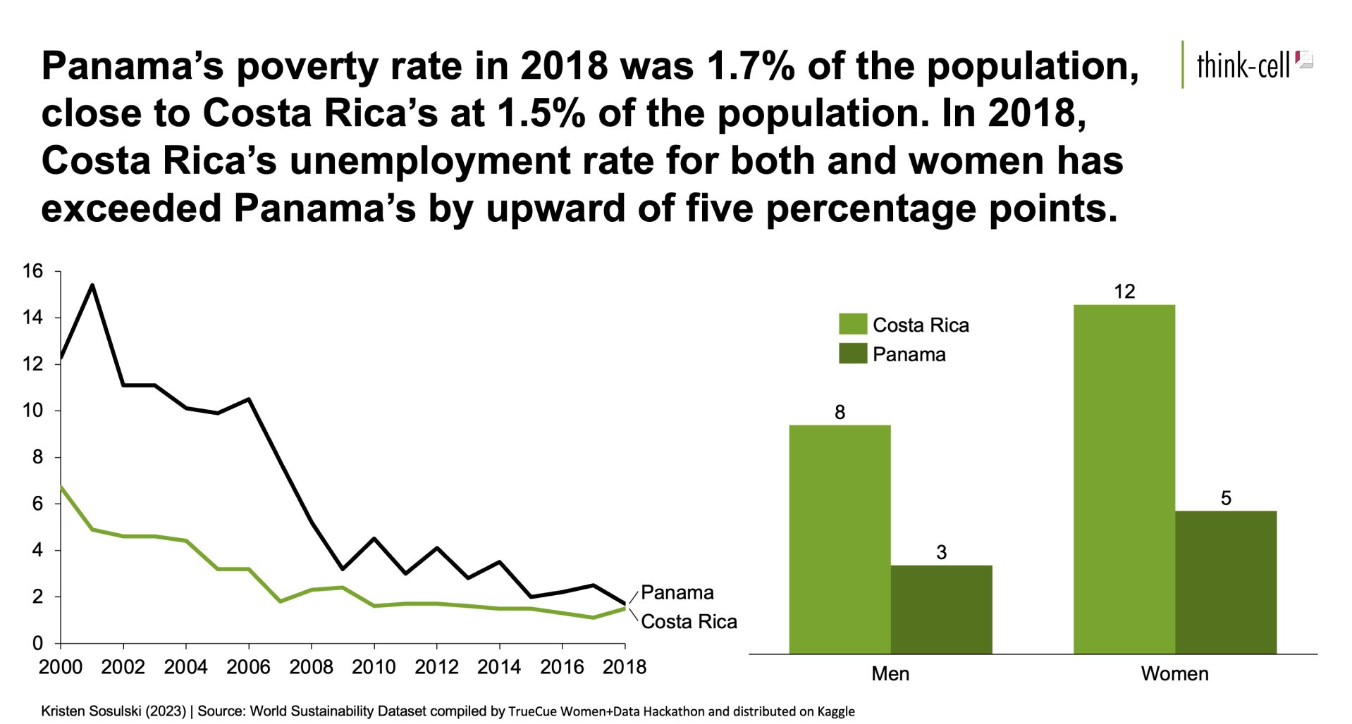
Notice if the same chart was presented as shown in Figure 5.2, it would be less readable at a smaller size.
Figure 5.2: A slide with too much information. It contains two charts, making it difficult for the audience to know which chart to focus their attention on.
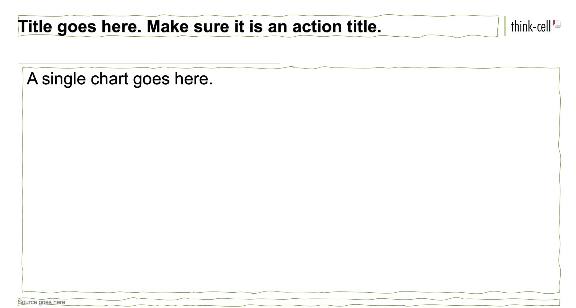
The suggested layout for charts and tables is the title and content slide layout, as shown in Figure 5.3. The title should be concise and specific. Generally, action titles communicate an outcome, quantify an insight, or provide time-bound actions2.
The chart should consume most of the slide to ensure the audience can easily see the details.
Finally, always include the data source for your chart at the bottom of the slide.
Figure 5.3: A well-designed slide that reduces the text shown on the screen
-
Learn more at: https://slidescience.co/action-titles/↩︎
Module 1
-
About Design Principles
-
1Chart Format
-
2Color
-
3Text, Labels, and Legends
-
4Readability
-
Test Your Knowledge
-
5Scales
-
6Data Integrity
-
7Chart Junk
-
8Data Density
-
9Data Richness
-
10Attribution
-
Test Your Knowledge
-
Exercise 1: Build a Vertical Bar
-
Exercise 2: Build a Line Chart
-
Exercise 3: Build a Waterfall Chart


