1. Chart Format
Picking the right chart type is easy when you know a) the type of data you are working with and b) the question you are trying to answer. Every chart should answer a question. The chart answers the question in a concise, easy-to-read graphical format. The data quickly determines the chart type. For example, if you have time series data, a line chart best shows the change over time. In comparison, a bar chart measures quantities by category and subcategory.
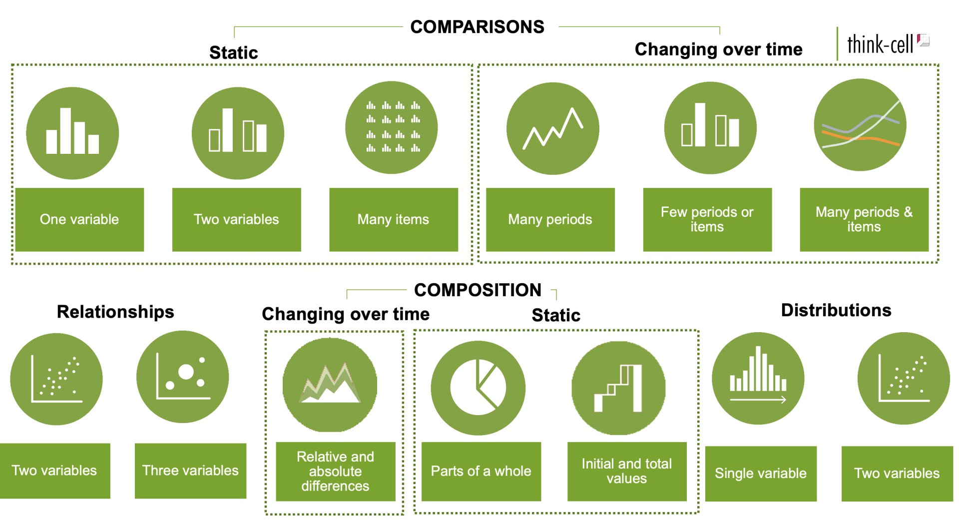
There are over two dozen chart types and variations available in think-cell. For guidance on the best chart type for your data, refer to Figure 1.21.
Figure 1.2: Chart chooser: Pick the right chart based on your data.
The table below illustrates the most common types of charts. We will create a vertical bar, line chart, and waterfall chart in this tutorial.
| Chart type | Data | Question? |
|---|---|---|
| Vertical bar 2 | Categorical | What are the quantities of each category? |
| Horizontal bar | Categorical | What are the highest and lowest quantities by category/rank? |
| Column bar | Categorical | What are the quantities of the subcategories? |
| Line chart | Time series | How did x change over time? |
| Area chart | Multiple time series | How did each category proportional change over time? |
| Waterfall chart | Time series | How did the starting value change to its final value? |
-
Influenced by Andrew V. Abela (2020) and The Data Visualisation Catalogue↩︎
-
Clustered bar is the equivalent think-cell chart type for vertical horizontal, and column bar charts ↩︎
Module 1
-
About Design Principles
-
1Chart Format
-
2Color
-
3Text, Labels, and Legends
-
4Readability
-
Test Your Knowledge
-
5Scales
-
6Data Integrity
-
7Chart Junk
-
8Data Density
-
9Data Richness
-
10Attribution
-
Test Your Knowledge
-
Exercise 1: Build a Vertical Bar
-
Exercise 2: Build a Line Chart
-
Exercise 3: Build a Waterfall Chart


