4. Readability
Font face
Select the same san-serif font for all of the chart elements. Examples include Arial, Helvetica, Avenir, and Roboto. Sans serif typefaces have lower stroke contrast and heights than serif fonts.
Font size
Set the font size of the chart text elements (labels, legends, titles, etc.) to at least 14-point font if used in a PowerPoint presentation and a minimum of 12-point font charts used in printed reports.
Italicized and bold font
Use boldface font for occasional highlighting. Limit the use of the italicized font. This may impede readability when used in abundance.
Text direction
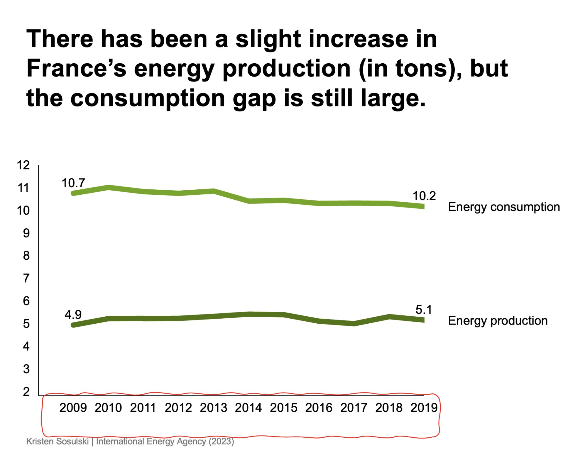
Align text horizontally. Avoid setting text vertically or at an angle. Angled or vertical text is more difficult to read. For example, figure 4.1 shows the x-axis labels vertically. Compare this to Figure 4.2, which presents the text horizontally. Horizontal text is easier to read.
Figure 4.1 highlights the chart with added labels to help interpret the message.
Figure 4.1: A line chart that shows the x-axis years presented vertically, which makes it more difficult to read
Figure 4.2 highlights the chart with added labels to help interpret the message.
Figure 4.2: A line chart that shows the x-axis years presented horizontally for easy readability
Module 1
-
About Design Principles
-
1Chart Format
-
2Color
-
3Text, Labels, and Legends
-
4Readability
-
Test Your Knowledge
-
5Scales
-
6Data Integrity
-
7Chart Junk
-
8Data Density
-
9Data Richness
-
10Attribution
-
Test Your Knowledge
-
Exercise 1: Build a Vertical Bar
-
Exercise 2: Build a Line Chart
-
Exercise 3: Build a Waterfall Chart

