8. Data Density
Data density refers to the amount of data shown in a chart. A common pitfall is showing too much data in a single chart.
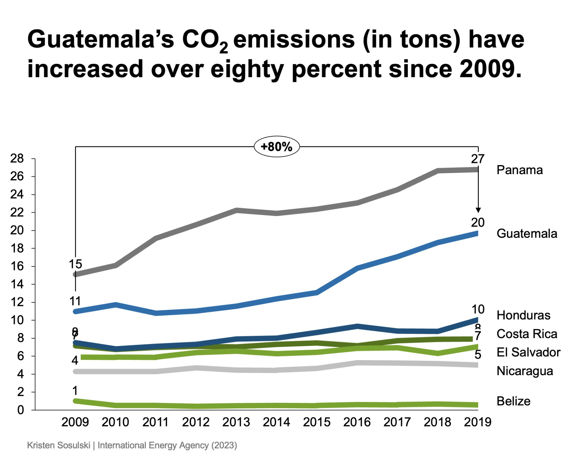
For example, if you are presenting the changing carbon dioxide emissions for Guatemala over the past ten years, you may not want to show that alongside all the countries in Central America on the same chart; see Figure 8.1.
Figure 8.1: A chart that shows too much data
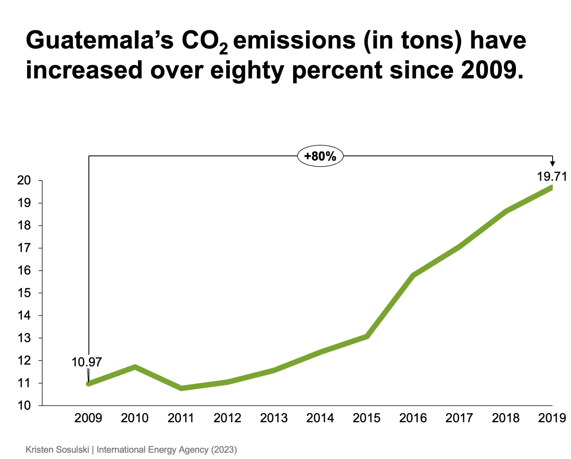
Instead, it would be best if you focused exclusively on Guatemala’s carbon dioxide emissions see Figure 8.2.
Figure 8.2: A chart presents the appropriate level of data for the message
Module 1
-
About Design Principles
-
1Chart Format
-
2Color
-
3Text, Labels, and Legends
-
4Readability
-
Test Your Knowledge
-
5Scales
-
6Data Integrity
-
7Chart Junk
-
8Data Density
-
9Data Richness
-
10Attribution
-
Test Your Knowledge
-
Exercise 1: Build a Vertical Bar
-
Exercise 2: Build a Line Chart
-
Exercise 3: Build a Waterfall Chart

