7. Chart Junk
Chart junk refers to the non-data elements on a chart, such as the borders, shadows, 3-D versions of 2-D charts, grid lines, and tick marks4. These non-data elements are usually extraneous, distract the reader, and can emphasize the wrong information in a chart. Keep your charts simple and avoid unnecessary bolding and decoration.
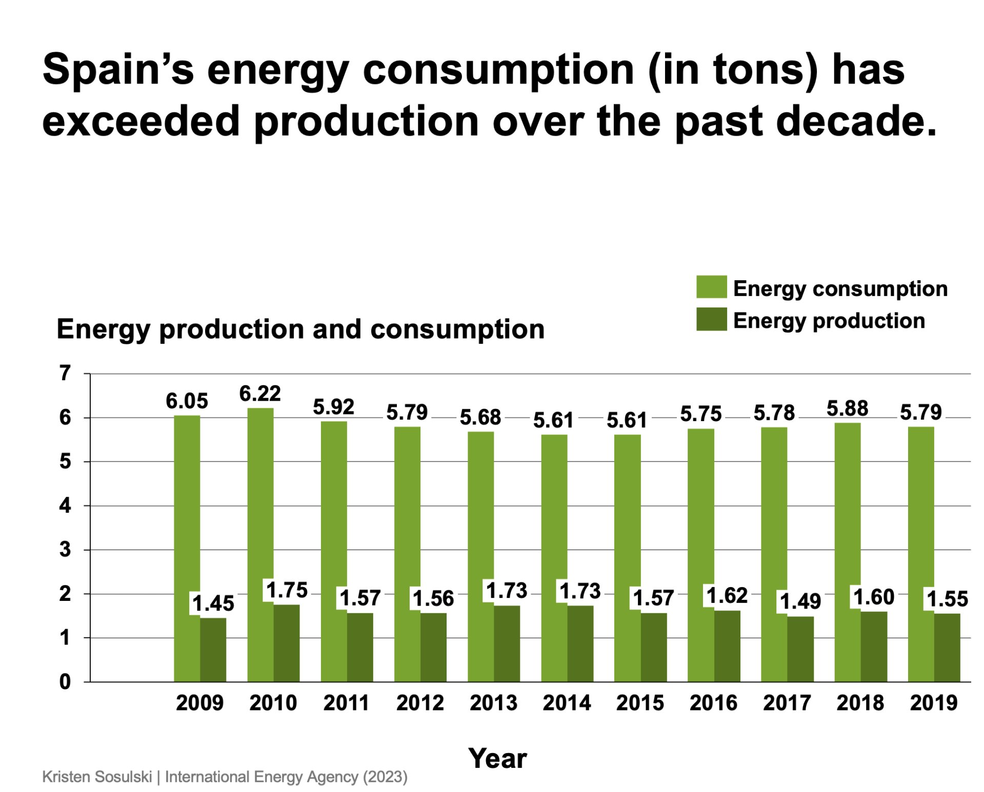
For example, in Figure 7.1, the chart is decorated with several non-data elements. However, the embellishment adds no additional information; therefore, it can be considered chart junk.
Figure 7.1: A chart that contains chart junk and extraneous information
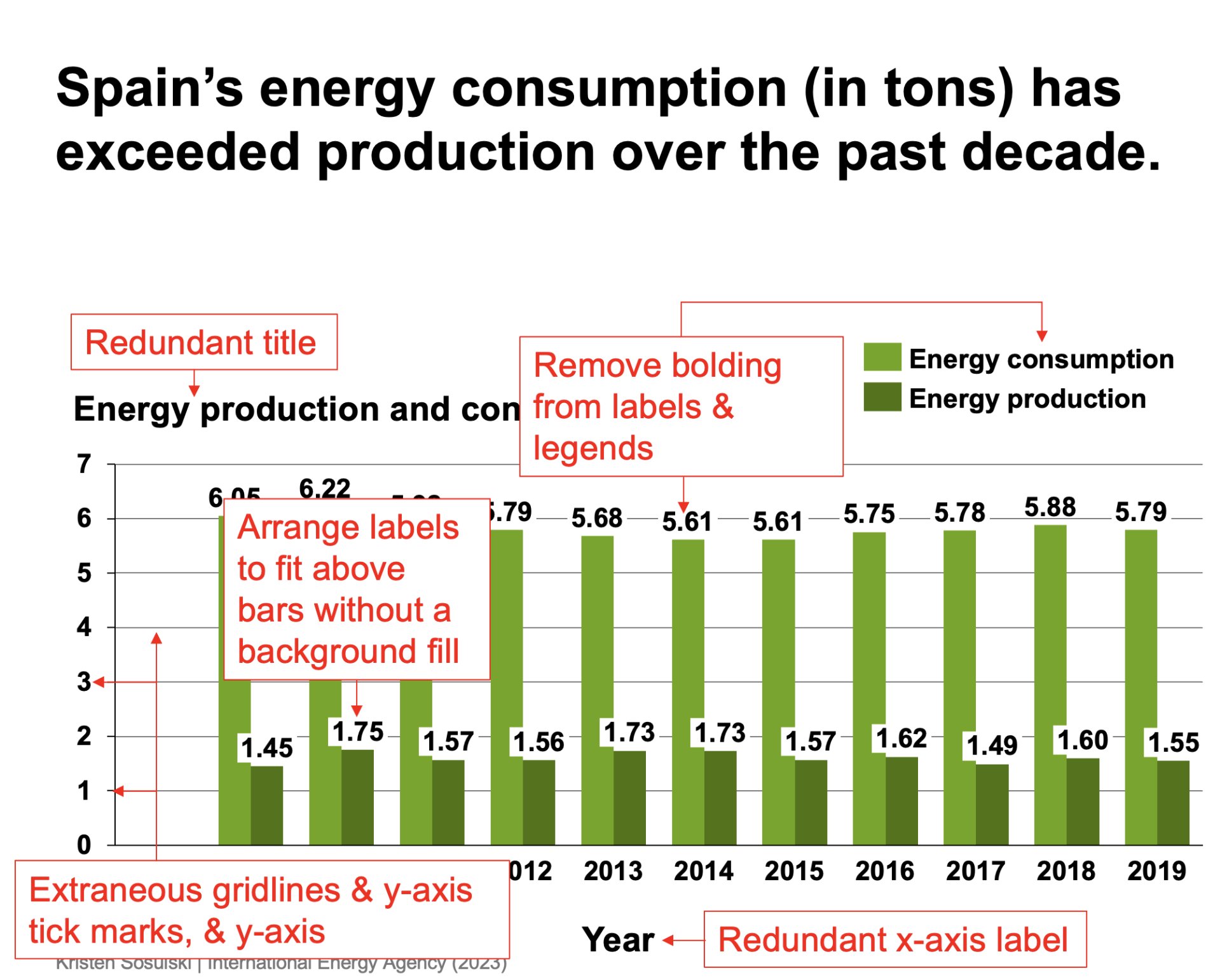
Figure 7.2 highlights all of the elements that are omitted. This includes:
- deleting the x-axis and y-axis titles;
- un-bolding the data labels, x-axis labels, and the legend text;
- arranging the labels to fit over bars without filling the background with white;
- omitting the y-axis, including the tick marks and labels; and
- removing the gridlines.
Figure 7.2: Chart junk highlighted in red
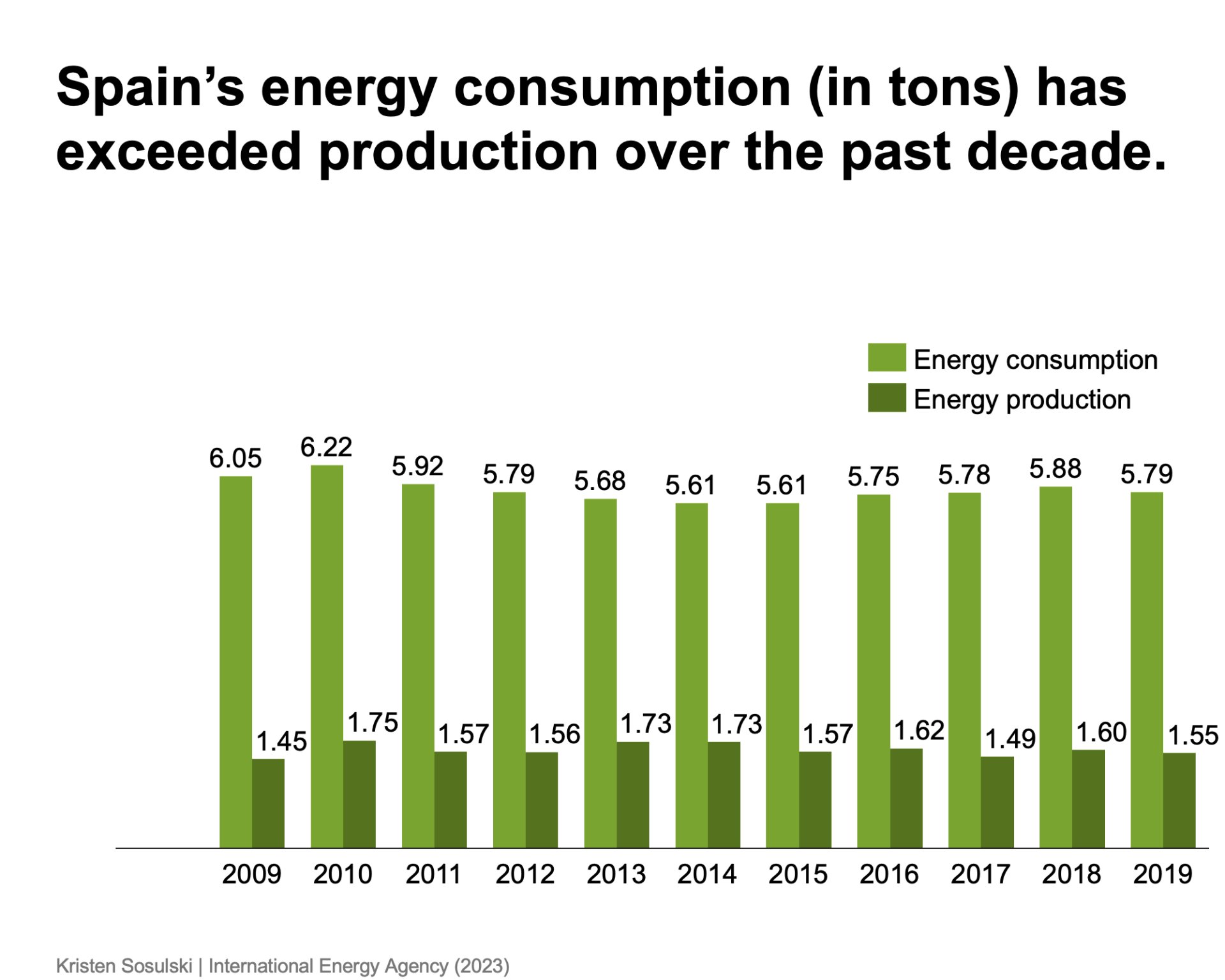
Simply omitting these non-data elements makes the chart easier to read and allows the data to be the focus. See Figure 7.3.
Figure 7.3: A revised chart with the chart junk removed
-
There are times when the gridlines and tick marks can be helpful, but it is essential not to overuse them.↩︎
Module 1
-
About Design Principles
-
1Chart Format
-
2Color
-
3Text, Labels, and Legends
-
4Readability
-
Test Your Knowledge
-
5Scales
-
6Data Integrity
-
7Chart Junk
-
8Data Density
-
9Data Richness
-
10Attribution
-
Test Your Knowledge
-
Exercise 1: Build a Vertical Bar
-
Exercise 2: Build a Line Chart
-
Exercise 3: Build a Waterfall Chart


