2. Color
Using or designing a PowerPoint theme for your slide presentation is recommended. This sets the style for your content, which includes font-face and color, slide background color, and accent colors for tables, graphics, and charts. think-cell uses Microsoft PowerPoint’s theme colors for many chart elements (e.g., text, arrows, etc.)1.
It’s easy to create a theme in PowerPoint and set your style for your entire presentation. To make a custom theme, start with a built-in theme and modify it by changing the colors, fonts, or effects. You can follow the steps in this tutorial
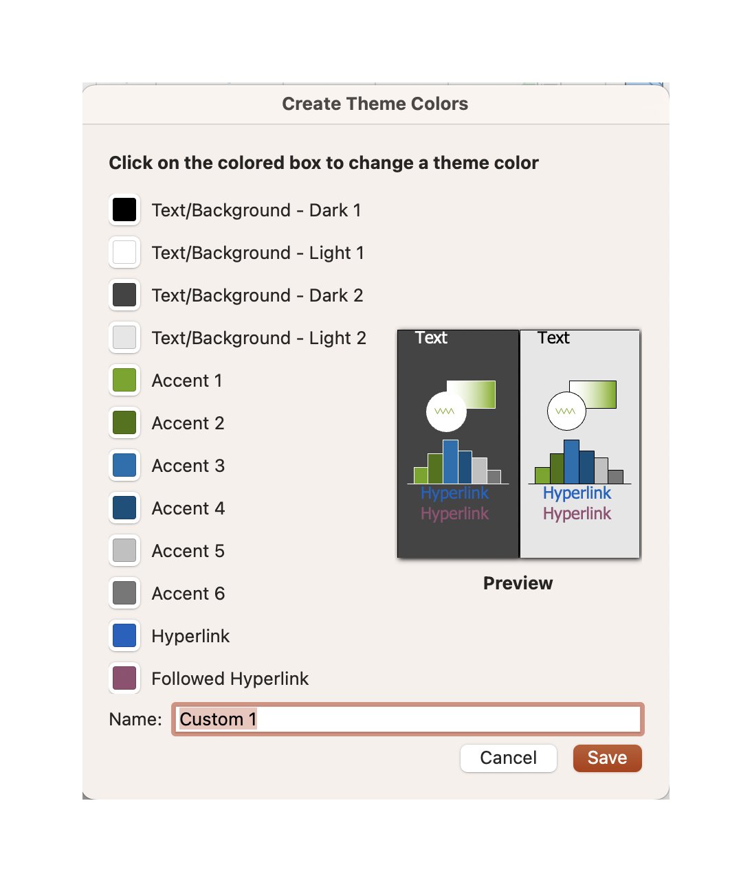
Open a new PowerPoint presentation. Change the color palette by going to Format > Themes colors. See Figure 2.1.
Figure 2.1: Setting the themes colors in PowerPoint
Text/Background Colors
Consider the following items when making selections regarding a slideshow theme.
- Use a light slide background color with black text when presenting in well-lit rooms with natural light. This combination also works well for online presentations via web conferencing via Zoom, Google Meet, or Microsoft Teams.
- A dark slide background with white text can offer suitable contrast for dimly lit rooms, large lecture halls, and stadiums.
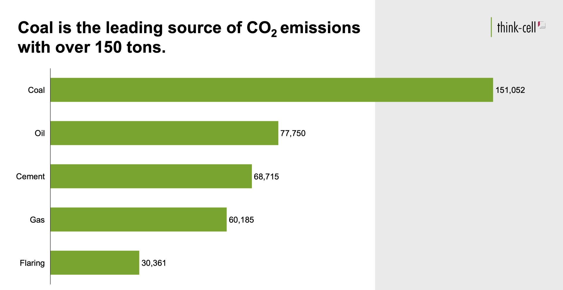
- When showing charts and graphs on slides, ensure that the chart background matches the slide background or vice versa. For example, see Figure 2.2, which illustrates the unnecessary contrast with different background colors of the chart and slide compared to keeping both colors identical.
Figure 2.2: Compare the background of each chart. The right chart has a partial white and gray background, whereas the chart on the left has a consistent white background.
Accent colors
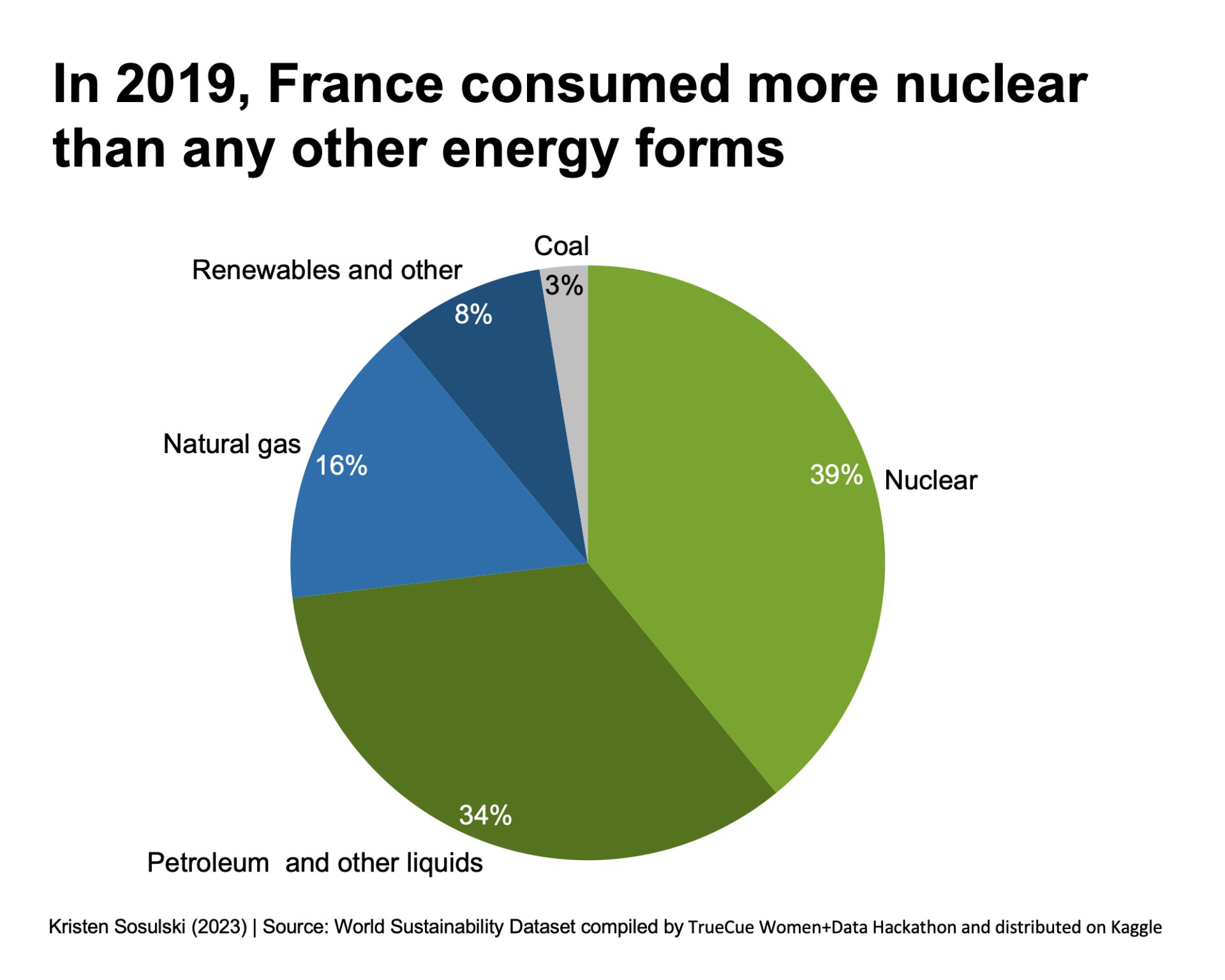
Take a look at Figure 2.3. The pie chart has five wedges, but only four are discernable when converted to grayscale. There is little difference in color density between Natural gas and Petroleum and other liquids. For readability, it is important to use accent colors in your charts that show a real difference in color density.
Figure 2.3: Compare the colors of the pie wedges. When converted to grayscale, two of the wedges look almost identical in color.
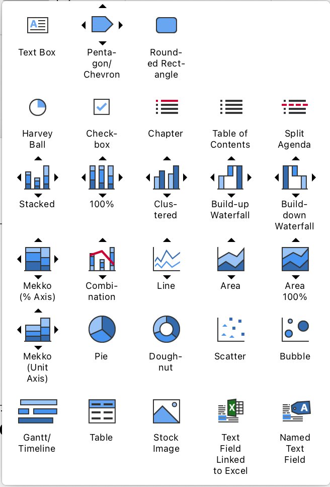
Accent colors can be used in the presentation of tables, smart art graphics, shapes, icons, and think-cell elements. See Figure 2.4 for the menu of think-cell elements.
Figure 2.4: A menu of think-cell elements
Consider the following tips when making selections regarding theme Accent colors.
- Choose colors that offer a high contrast between the slide background and the accent color
- Ensure there is excellent contrast among the accent colors
- Test the contrast by converting to grayscale or printing the slides in black and white
For example, for the colors selected in this theme, some accent colors are indistinguishable when converted to grayscale. Specifically accent colors 2, 3, 4, and 6. Therefore, a good practice is to convert your slides to grayscale, and you can easily see these differences.
Figure 2.5: Setting the theme’s colors in PowerPoint (left). The same color settings convert to grayscale make many of the colors indistinguishable from each other(right)
-
Learn more at: https://www.think-cell.com/en/resources/kb/0105↩︎
Module 1
-
About Design Principles
-
1Chart Format
-
2Color
-
3Text, Labels, and Legends
-
4Readability
-
Test Your Knowledge
-
5Scales
-
6Data Integrity
-
7Chart Junk
-
8Data Density
-
9Data Richness
-
10Attribution
-
Test Your Knowledge
-
Exercise 1: Build a Vertical Bar
-
Exercise 2: Build a Line Chart
-
Exercise 3: Build a Waterfall Chart


