6. Data Integrity
Preserve the integrity of data throughout the entire process of visualizing it. It is easy to accidentally alter data—for example, by mislabeling categories, legends, or axes. Moreover, particular types of charts can distort the data presentation, as can changing the baseline of a bar chart.
Ensure proper precision and labeling
The default labels only sometimes provide the most accurate measure. Be sure to use a precision level matching the changes in the chart shown.
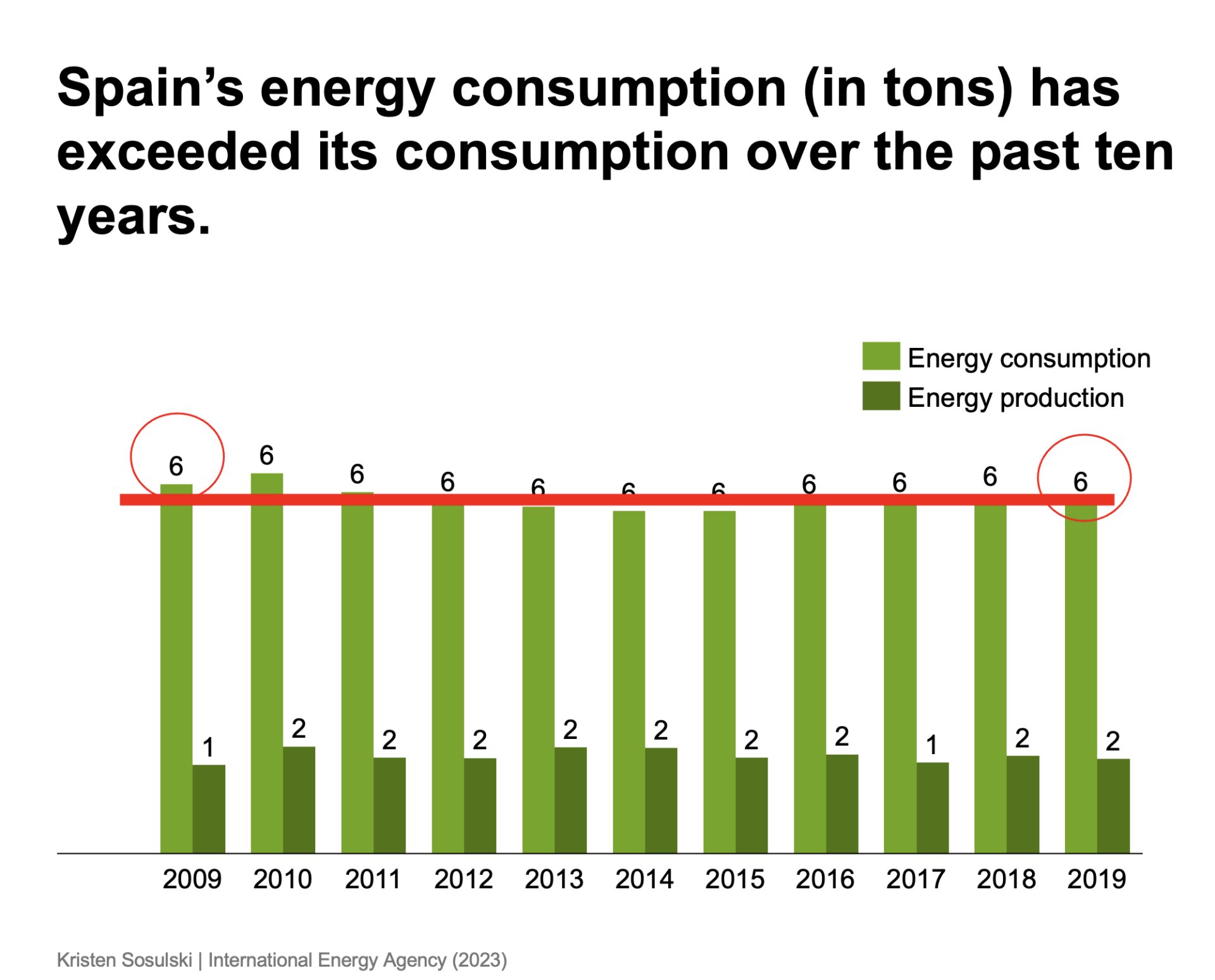
Figure 6.1 is an example of a bar chart with direct value labels. As you can see, many values are labeled identically but with differing bar heights. This can be misleading.
Figure 6.1: A chart that shows a mismatch of the data labels with the bar height
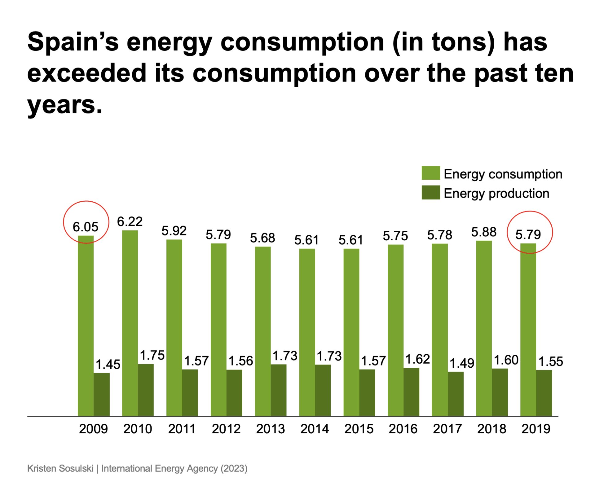
In Figure 6.2, the value labels have been altered to display two decimal places. This presents a more accurate representation of the data values and the bars.
Figure 6.2: A chart that shows a precise use of the data labels with the bar height
Zero baseline
Use a zero baseline for all bar charts to ensure data integrity. A common mistake is to change the starting point of the y-axis to a non-zero value. This results in an over-exaggeration of the change shown in the graphic that is different from the difference shown in the data.
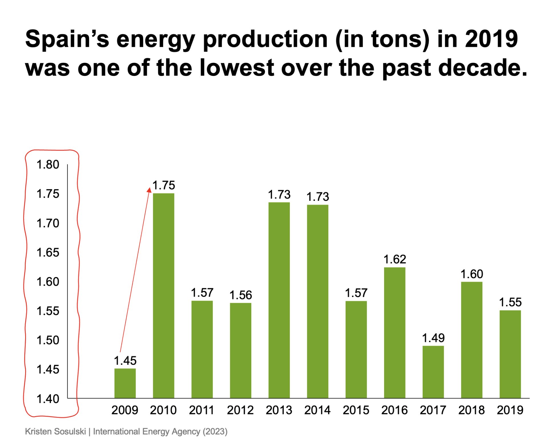
In Figure 6.3, observe the baseline of the y-axis. It is set to 1.40 tons. The data for 2009, 2010, and 2011 are 1.45, 1.75, and 1.56 tons, respectively. However, the difference in the bars between 2009 and 2019 presents well over a 500% change. In reality, the difference between 1.45 and 1.75 is .30, or a percentage increase of 20.69%.
Figure 6.3: A chart that shows the improper use of a non-zero baseline with a bar chart
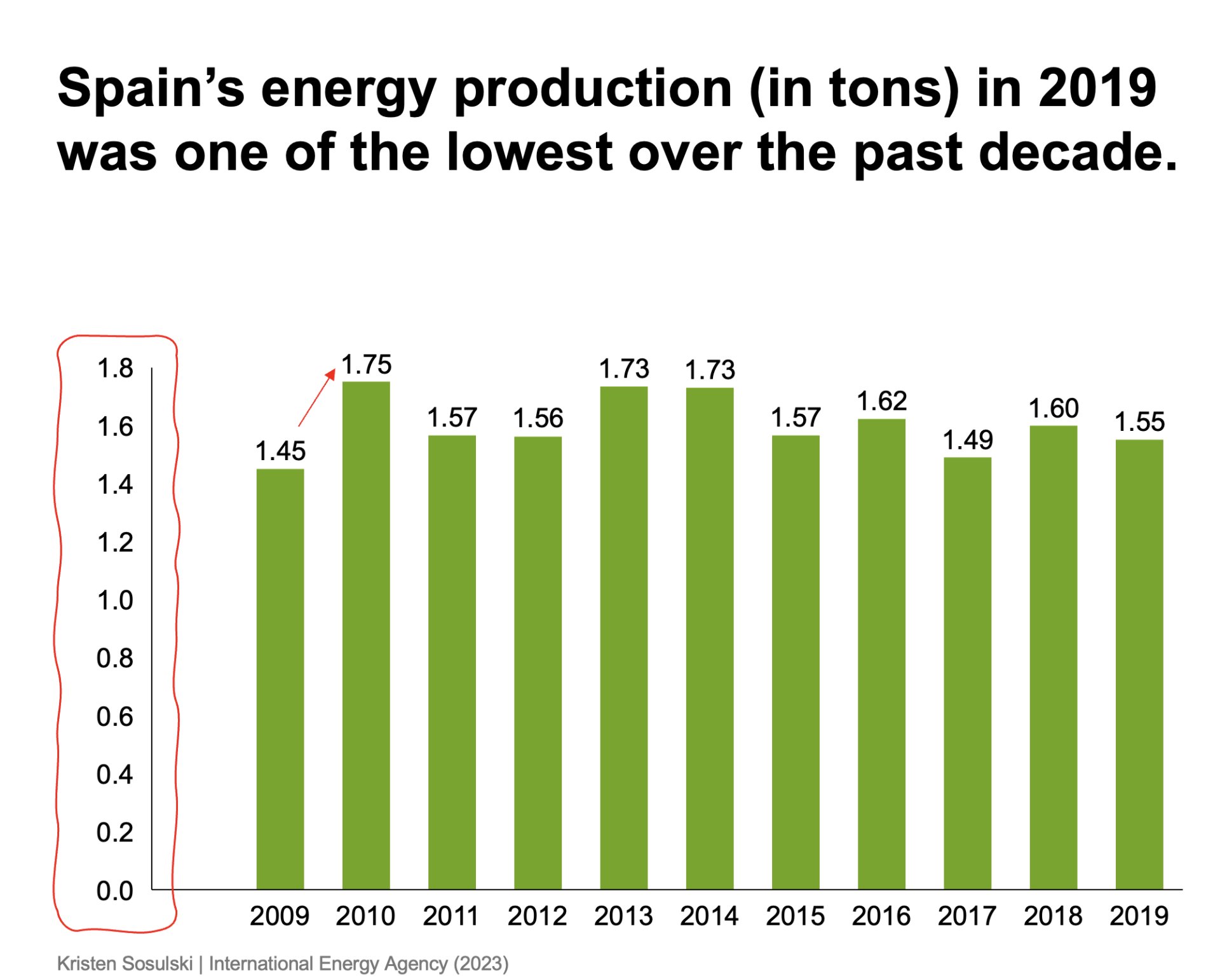
Figure 6.4 shows the minimum y-axis value set to zero. The chart shows the difference between the values accurately.
Figure 6.4: The proper use of the zero baseline with a bar chart
However, for line charts, the minimum y-value may be set to the minimum value in the data or a step below it. This is illustrated in Figure 5.2 to show the variation in the time series data.
Module 1
-
About Design Principles
-
1Chart Format
-
2Color
-
3Text, Labels, and Legends
-
4Readability
-
Test Your Knowledge
-
5Scales
-
6Data Integrity
-
7Chart Junk
-
8Data Density
-
9Data Richness
-
10Attribution
-
Test Your Knowledge
-
Exercise 1: Build a Vertical Bar
-
Exercise 2: Build a Line Chart
-
Exercise 3: Build a Waterfall Chart


