Exercise 1: Build a Vertical Bar
In this exercise, we are going to create a vertical bar chart.
What are vertical bar charts best used for? Answer the question below.
Vertical bars are best for showing:
- discrete quantities by year
- locations of addresses
- proportions of a whole
If you selected the first option, you are correct. Vertical bars are commonly used to show discrete quantities over time. They are used when bars cannot be sorted in ascending or descending order. For instance, if the x-axis represented 2019-2023, there would be four bars, each representing a year. The years could not be logically reordered based on their values. The year variable would dictate the order.
Objective
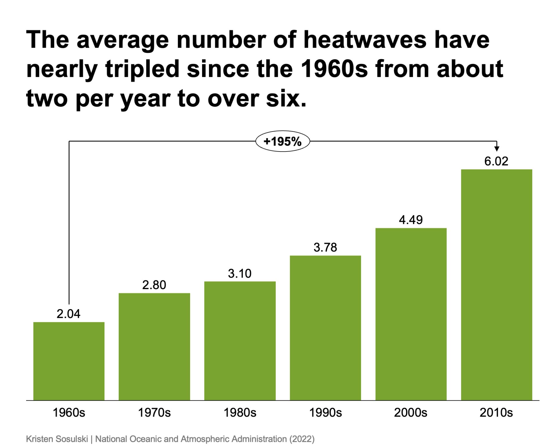
Using data sourced from the United States Environmental Protection Agency5, create a chart that shows the change in the average number of heatwaves over time.
- Recreate the following chart as shown in Figure 10.2
- Question: Has the average number of heatwaves changed significantly since 1980?
- Chart type: think-cell clustered bar chart with one series
Figure 10.2: A think-cell clustered bar chart with one series
STEP 1. Download and open the Excel data document
- Download the following Excel file. You will use this file to recreate Figure 10.2
- After you have downloaded the file, open it
STEP 2. Create a clustered bar chart
- Go to the Excel file, navigate to sheet Stacked bar chart and select and copy cells A1:G3
- In PowerPoint, go to the Insert > Elements menu, and choose Clustered Bar.6
- Next, PowerPoint prompts you to select a place for the chart
- Double-click on the chart in PowerPoint to open the datasheet
- Replace the values in the data sheet with those you copied from Excel
STEP 3. Arrange, size, and format the chart elements
- Size the chart to fill most of the white space on the slide
- Since there is only one series, delete the redundant legend label, Frequency, by clicking on it and pressing the delete key on your keyboard
STEP 4. Increase the precision used for the direct bar labels
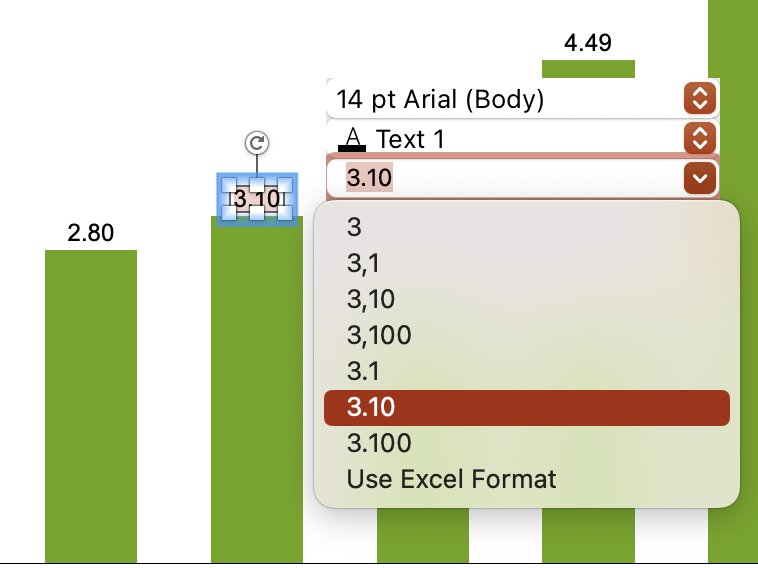
You will notice that the bars are already directly labeled. Select a single label and increase the precision of bar labels to two decimal places. Single click on the label to bring up the think-cell formatting window as shown in Figure 10.3.
Figure 10.3: The think-cell formatting window with options to increase the number of decimal places
STEP 5. Add a total difference arrow
Add a total difference arrow to translate the change from the 1960s to the 2010s to a percentage
- Click on the bar for 1960s, CTRL + Click to bring up the menu and select Total Difference Bar
- Move the end anchor for the total difference bar to the 2010s bar.
STEP 6. Reduce chart height and increase bar width
- Reduce the chart’s height to fit below the space for the title and subtitle
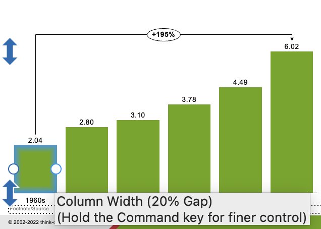
- Increase the bar column width to be twice the width of the space between clicking on a bar and selecting CTRL + Click to reduce the column width gap to 20%, as shown in Figure 10.4
Figure 10.4: The think-cell option to reduce the column width gap to 20%
STEP 7. Title the chart
Title the chart with an action title: The average number of heatwaves have nearly tripled since the 1960s from about two per year to over six.
STEP 8. Add attribution
Add attribution at the bottom right or left of your chart. For example, include your name and the data source as: Your Name | National Oceanic and Atmospheric Administration (2022). Use the text tool in PowerPoint to insert a text box and type your text. Arrange the text so it appears at the lower right or left of your chart.
SUMMARY: A before and after
Review the video below to see the chart before the design principles were applied and after they were applied.
Module 1
-
About Design Principles
-
1Chart Format
-
2Color
-
3Text, Labels, and Legends
-
4Readability
-
Test Your Knowledge
-
5Scales
-
6Data Integrity
-
7Chart Junk
-
8Data Density
-
9Data Richness
-
10Attribution
-
Test Your Knowledge
-
Exercise 1: Build a Vertical Bar
-
Exercise 2: Build a Line Chart
-
Exercise 3: Build a Waterfall Chart


