Exercise 2: Build a Line Chart
In this exercise, we are going to create a line chart.
What do you think line charts are best used for? Answer the question below.
Line charts are best for showing:
- proportional change over time
- change over time
- comparisons of discrete quantities
If you selected the second option, you are correct. Line bars are commonly used to change over time for one or more series. Lines work best when the values are continuous rather than discrete. With line charts, we typically look for trends such as growth and decline.
Objective
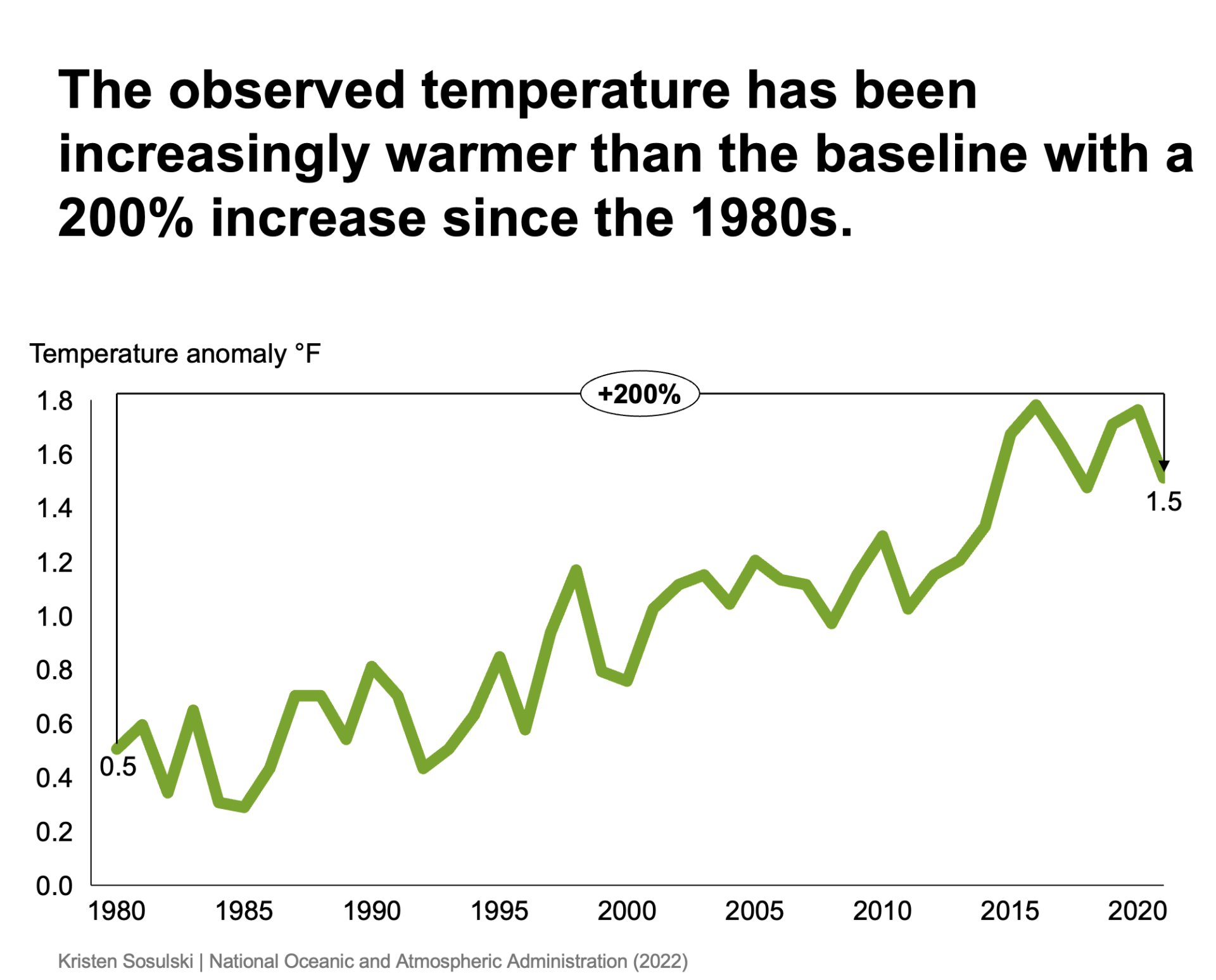
Using data sourced from the United States Environmental Protection Agency7, create a chart shows the whether or not worldwide temperatures have differed from the baseline over time.
- Recreate the following chart as shown in Figure 10.5
- Question: How have the worldwide temperatures differed from the baseline over time?
- Chart type: think-cell line chart
Figure 10.5: A think-cell line chart
STEP 1. Download and open the Excel data document.
- Download the following Excel file. You will use this file to recreate Figure 10.5
- After you have downloaded the file, open it
STEP 2. Create a line chart
- In the Excel file, navigate to sheet Line chart and select and copy cells A1:AR3. Note that the original data was from 1901 to 2021. The data has been filtered to reduce data density and to focus our exploration of temperature change from the 1980s and beyond.
- In PowerPoint, go to the Insert > Elements menu, and choose Line8
- Next, PowerPoint will prompt you to select a place for the chart
- Double-click on the chart in PowerPoint to open the datasheet
- Replace the values in the data sheet with those you copied from Excel
STEP 3. Arrange, size, and format the chart elements
- Size the chart to fill most of the white space on the slide
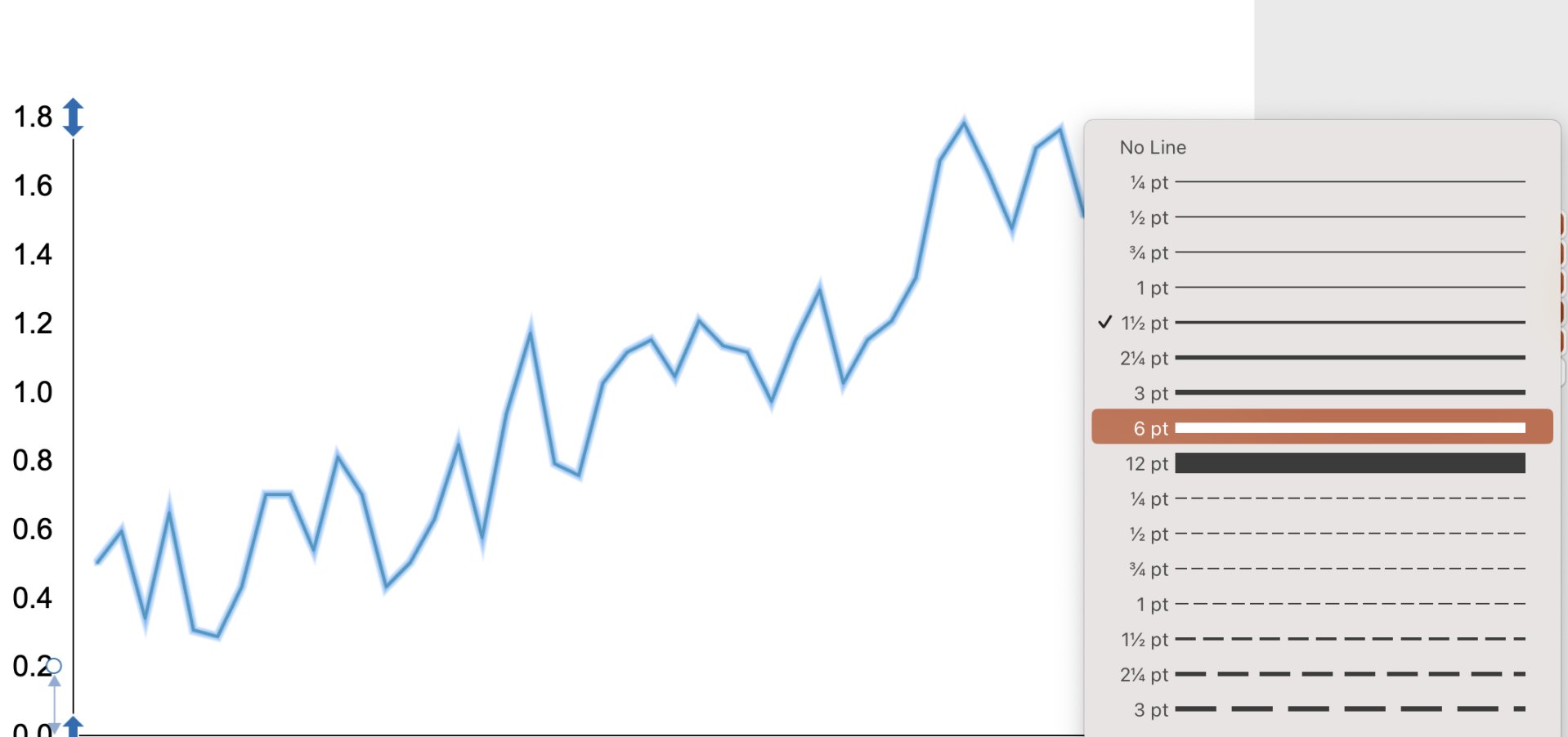
- Increase the weight of the chart line from 1.5 points to 6 points to increase readability. Then, click on the line and use the think-cell formatting menu. Change the line width from 1.5 to 6 points; see Figure 10.6
Figure 10.6: The think-cell menu to increase the thickness of the chart line
STEP 4. Format the y-axis
- Delete the line series label using Click + DELETE. Next, add a new text box with the text
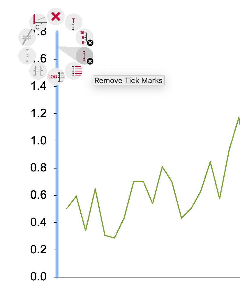
Temperature anomaly °Fand arrange it above the top value of the y-axis - Remove the tick marks from the y-axis by pressing CTRL + Click and selecting the Remove tick marks option from the think-cell menu, see Figure 10.7
Figure 10.7: The think-cell option to remove tick marks from an axis
STEP 5. Set the scaling for the x-axis
Set the scaling of years on the x-axis in five-year increments.
- On the x-axis, click on the the first value,
1980and press SHIFT + Click and select the last value,2021.Then change the font to a very small size, such as 4 points - Manually delete all years except for 1980, 1985, 1990, 1995, 2000, 2005, 2010, 2015, and 2020
- Change the font size to 14 points for the x-axis category labels
STEP 6. Add endpoint value labels
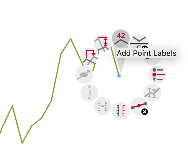
- To add a value endpoint label of 1.5 for 2021, CTRL + Click on the last data point on the line and select Add point labels, see Figure 10.8
- Add label for 1980 by CTRL + Click on the first data point on the line and select Add point labels
- Format the labels to one decimal place by clicking on the label and modifying the decimal places using the think-cell formatting menu
Figure 10.8: The think-cell option to add point labels
STEP 7. Add a total difference arrow
Add a difference arrow from 1980 to 2021
- CTRL + Click on the 1980 data point and select the Add total difference arrow
- Move the anchor from the second data point, 1981 to 2021. Watch the video below for a demonstration
STEP 8. Title the chart
Title the chart with the action title: `The observed temperature has been increasingly warmer than the baseline with a 200% increase since the 1980s.
STEP 9. Add attribution
Add attribution at the bottom right or left of your chart. For example, include your name and the data source as: Your Name | National Oceanic and Atmospheric Administration (2022). Use the text tool in PowerPoint to insert a text box and type your text. Arrange the text to appear at your chart’s lower right or left.
SUMMARY: A before and after
Review the video below to see the chart before the design principles were applied and after they were applied.
Module 1
-
About Design Principles
-
1Chart Format
-
2Color
-
3Text, Labels, and Legends
-
4Readability
-
Test Your Knowledge
-
5Scales
-
6Data Integrity
-
7Chart Junk
-
8Data Density
-
9Data Richness
-
10Attribution
-
Test Your Knowledge
-
Exercise 1: Build a Vertical Bar
-
Exercise 2: Build a Line Chart
-
Exercise 3: Build a Waterfall Chart


