17. Tables
Using the table element you can insert a table that will be automatically resized and positioned on your slide.
You can link a think-cell table to an existing Excel worksheet, either by creating a think-cell table in PowerPoint directly from the think-cell ribbon in Excel or by connecting an existing table to an Excel range. In both cases, the table will appear in the Data Links dialog together with all linked charts. See 22.4 Creating a table from Excel for more information.
Contents
17.1 Inserting a table
To insert and place a table on your slide, choose 
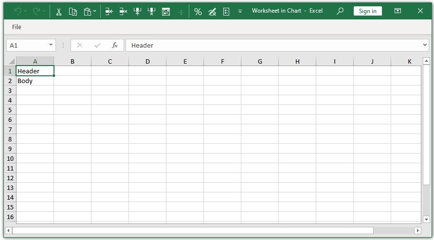
To open the datasheet again later, double-click any table cell.
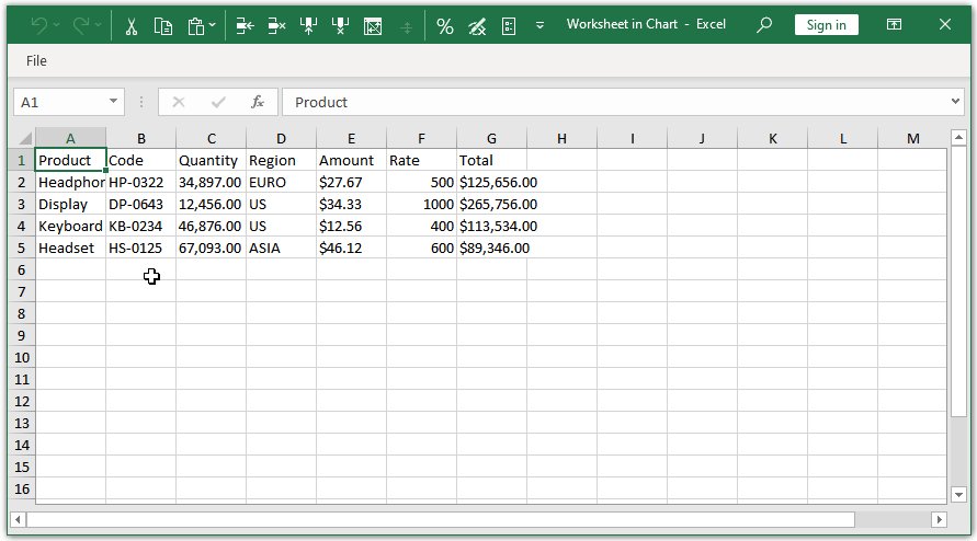
Whenever you change or add data, your think-cell table will reflect this. You do not need to manually add additional columns or rows.

In the same way, you can simply delete cells, rows or columns from the datasheet to remove them from the table.
17.2 Setting the size and position of a table
Your table will be resized automatically based on its contents and placed on the slide automatically based on other think-cell elements on the slide (unless its edges are fixed to a position as indicated by red lines with closed locks). A table is made up of think-cell text boxes. In addition to changing the table's datasheet, you can also insert, delete, duplicate and move cells and whole columns and rows as described in 15. Text boxes.
To override the automatically determined size and position of the table, you can resize the table by holding down the Ctrl key and dragging and fix its position by using the locks (see 15.8 Setting a fixed size or locked position of elements).
17.3 Formatting a table
You format a table like any other think-cell element by changing the font and font colors and setting a table cell background fill (see 3.4 Format and style elements). To format a whole column or row, use multi-selection with the lasso or the Shift and Ctrl keys (see 3.3.3 Select multiple objects).
The alternate row colors feature is especially useful for tables. To set alternate row colors:
- Select all rows that should alternate between colors.
- Choose Horizontal Stripes from the alternate colors control.

- The think-cell toolbar now includes two fill color controls instead of one. Use them to set the colors the rows should alternate between.
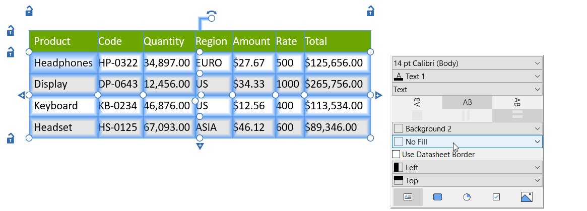
Alternatively, you can let the formatting of a table cell be controlled by that of the corresponding datasheet cell, by setting Use Datasheet...
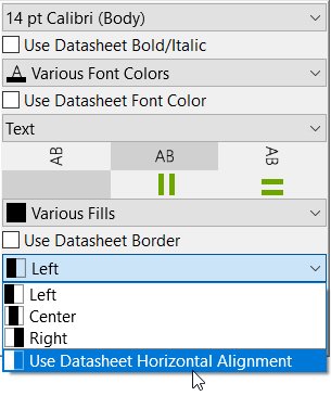
- Bold/Italic
- Font Color
- Fill
- Horizontal/Vertical Alignment
using the corresponding control in the floating toolbar.
To also have the borders between cells styled exactly as they are in Excel, simply select any cell in the table and activate Use Datasheet Border in the floating toolbar.
Note: The option to Use Datasheet Border is always activated or deactivated for the whole table at once.
These options are particularly useful when creating a table from an already formatted Excel sheet, as explained in 22.4 Creating a table from Excel.
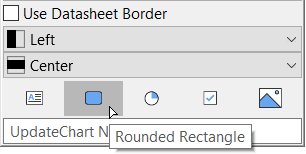
You can also style any cell in a table as a Rounded Rectangle, by selecting it and clicking Rounded Rectangle in the cell content control.
17.4 Adding Harvey balls, checkboxes and images
Instead of text, table cells can also contain Harvey balls and checkboxes, as well as images, whose state is dynamically controlled by the internal datasheet or a linked range in an Excel sheet.
To have a cell display any of these items, simply select it from its content control in the floating toolbar. Depending on the item chosen, the linked Excel cell must contain the following:

A number between 0 and the maximum number of segments selected (by default 4), indicating how many filled segments should be shown.

v, o or 1 for a box with a check mark; x or 2 for a box with a cross; Space or 0 for an unchecked box

A valid internet address at which the image can be found, for example obtained by right-clicking an image on the web in your browser and selecting Copy image link/address.
Note: When the data value in the linked cell cannot appropriately be represented by the selected content, for example when entering text as data for a cell containing a Harvey ball, or entering an invalid link for an image, a red exclamation mark 
Harvey balls and checkboxes can be formatted as explained in 20. Checkboxes and Harvey balls.
Images can be cropped as explained in 18.3.3 Crop images.
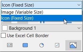
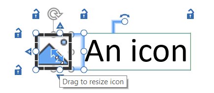
There is also an additional control in the floating toolbar, allowing you to select whether the linked image is to be used as an Image (Variable Size), in which case it will always fill the whole cell, or as an Icon (Fixed Size), in which case it will have a fixed height given in pt, and will be placed in the middle of the cell if the cell is larger than the space the image needs at that size.
17.5 Rounded rectangle
To insert a rounded rectangle, select think-cell > Elements > Rounded Rectangle 

To change the appearance of a rounded rectangle, select the element and open the mini toolbar. You can change the fill color, outline color, and outline style controls. To learn more, see 3.4 Format and style elements.
Charting
Layout
-
14.Introduction to layout
-
15.Text boxes
-
16.Process flows
-
17.Tables
- 17.1
- Inserting a table
- 17.2
- Setting the size and position of a table
- 17.3
- Formatting a table
- 17.4
- Adding Harvey balls, checkboxes and images
- 17.5
- Rounded rectangle
-
18.Images and icons
-
19.Agendas
-
20.Checkboxes and Harvey balls
-
21.think-cell Tools
