5. Data entry
Contents
5.1 Internal datasheet
Every chart created with think-cell has an associated datasheet. The datasheet is opened by double-clicking the chart or by clicking the 
think-cell uses a customized Microsoft Excel sheet for data input, which you can use in the same way as regular Excel. You can use all the same shortcut keys, you can enter formulas instead of numbers, and so forth. But of course you can also use an Excel file as a data source (see 22. Excel data links).
To insert or delete a row (or column) you can use the respective buttons in the toolbar of the datasheet. The standard buttons for undo and redo and cut, copy and paste are available as well.
Note: If you have Microsoft’s Chinese Conversion feature installed, you will find the options Simplified Chinese and Traditional Chinese in the datasheet’s toolbar.
5.2 Absolute and relative values
The think-cell datasheet alternatively supports entry of absolute or relative values. The distinction between the two types of data is made by the Excel cell formatting. You can always toggle the interpretation of a column’s data with the 
Keep in mind that for the display in the chart, it does not matter if you enter percentages or absolute values. If you enter absolute values but want to label the chart with percentages (or vice versa), think-cell performs the necessary conversion (see 6.5.5 Label content). A simple datasheet with only absolute values looks like this:
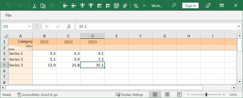
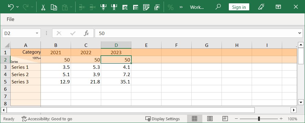
For simple charts based on absolute values only, the 100%= row on top of the chart data can be left empty. If you choose to label the chart with percentages, the percentages are calculated from the absolute values, assuming the sum of each column to be 100%. You can enter explicit values in the 100%= row to override this assumption. The following datasheet calculates percentages based on 100% being equal to a value of 50:
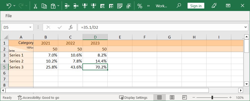
Alternatively, you can fill in the datasheet with percentages. Again, you can choose to label the chart with absolute or relative values. In order to have think-cell calculate absolute values from the percentages you entered, you should fill in the absolute values that represent 100% in the 100%= row. The following datasheet uses percentages to specify the same data values:
The default behavior of the datasheet depends on the chart type: 100%-charts and area or Mekko charts with %-axis as well as pie charts default to percentages, while all other charts default to absolute values.
5.3 Transposing the datasheet
The layout of a think-cell datasheet depends on the chart type. In bar charts, for example, columns contain the data for a single series, while in column charts, rows contain the data for a single series. Here is a typical datasheet for a column chart:
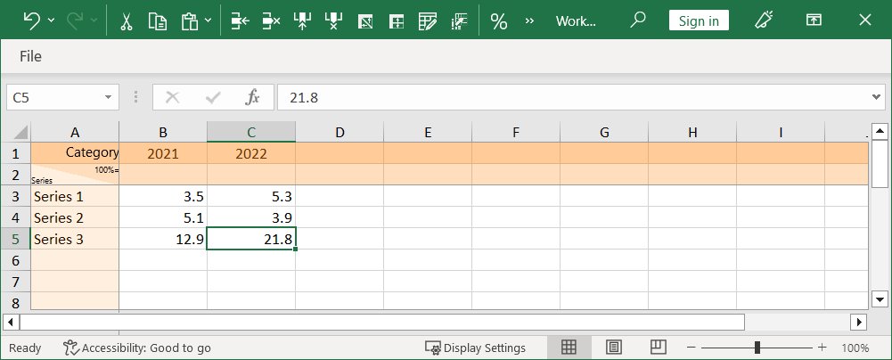
If you would instead like to work with a datasheet where columns contain the data for a single series, with rows representing categories, you can simply click the 
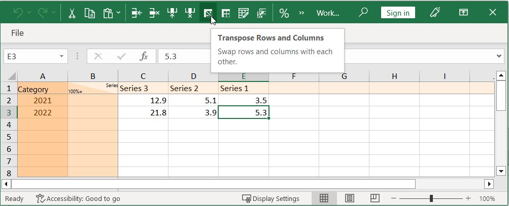
Note that the columns have also been flipped to preserve the relationship between the visual order of data in the datasheet and the order of the data in the chart.
5.4 Reverse order in datasheet
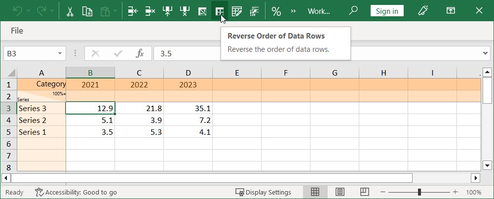
In think-cell, the visual order of data in the datasheet always corresponds to the order of the data in the chart. This is also true for flipped charts (see 3.5.2 Rotate and flip elements). If you want to flip the data in the datasheet, you can use the 

5.5 Edit data layout
You can decide whether to include any of the special rows and columns in the datasheet, such as the Series label column, the 100%= row, or the Category label row.
To do so, click 
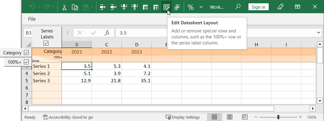
Note: The top-left-most cell that is not a special cell is always interpreted as the first data cell. This means for example that when the 100%= row has been disabled in a non-transposed datasheet, where rows represent series, the data for the first series would start in cell B2, and its series label would be in cell A2. Special rows and columns that have been removed from the datasheet are effectively treated as empty; for example, in a datasheet without a 100%= row, the sum of the absolute values will be used as the reference for calculating percentages displayed in the chart as explained in 5.2 Absolute and relative values.
5.6 Chart scanner
Scan an image of a bar or column chart on your screen and use the scanned data in a think-cell chart or an Excel sheet. You can scan images from any source on your screen, such as websites, PDF documents, or applications.
5.6.1 Use the chart scanner in PowerPoint
To scan an image and use the scanned data in a think-cell chart, follow these steps:
- In PowerPoint, create any chart except a scatter chart, a bubble chart, a Mekko chart with unit axis, and a Gantt chart.
- Open the chart’s datasheet: double-click the chart, or select the chart and select Open Datasheet

- In the datasheet's toolbar, select Extract and Paste Numerical Data
- Move and resize the chart scanner window so that the capture area contains the image you want to scan. Include only the chart area, axes, and labels. Keep headers, references, and explanations outside the capture window.
- Wait for the chart scanner window to finish scanning. When the chart scanner finishes scanning, it outlines the chart segments in red and the chart baseline in green, and enables the Fill Datasheet button.
- To rescan the image, move or resize the chart scanner. If the chart scanner can't scan your image accurately, inform think-cell support by selecting Report Bad Scan.
- To insert the scanned data into your datasheet, select Fill Datasheet. The chart updates to reflect the new data. Close the chart scanner.
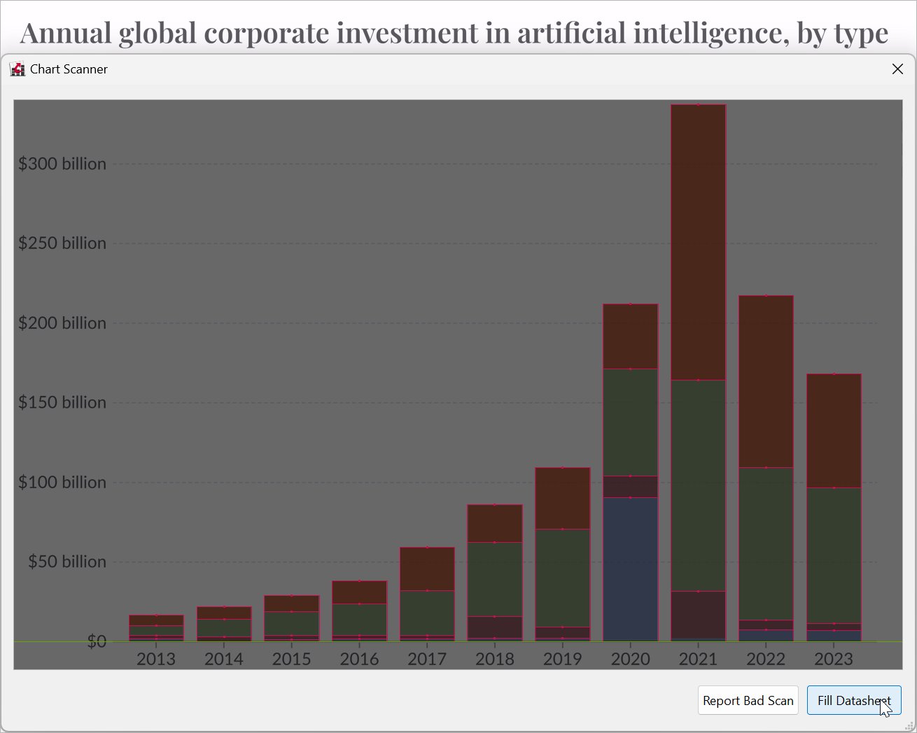
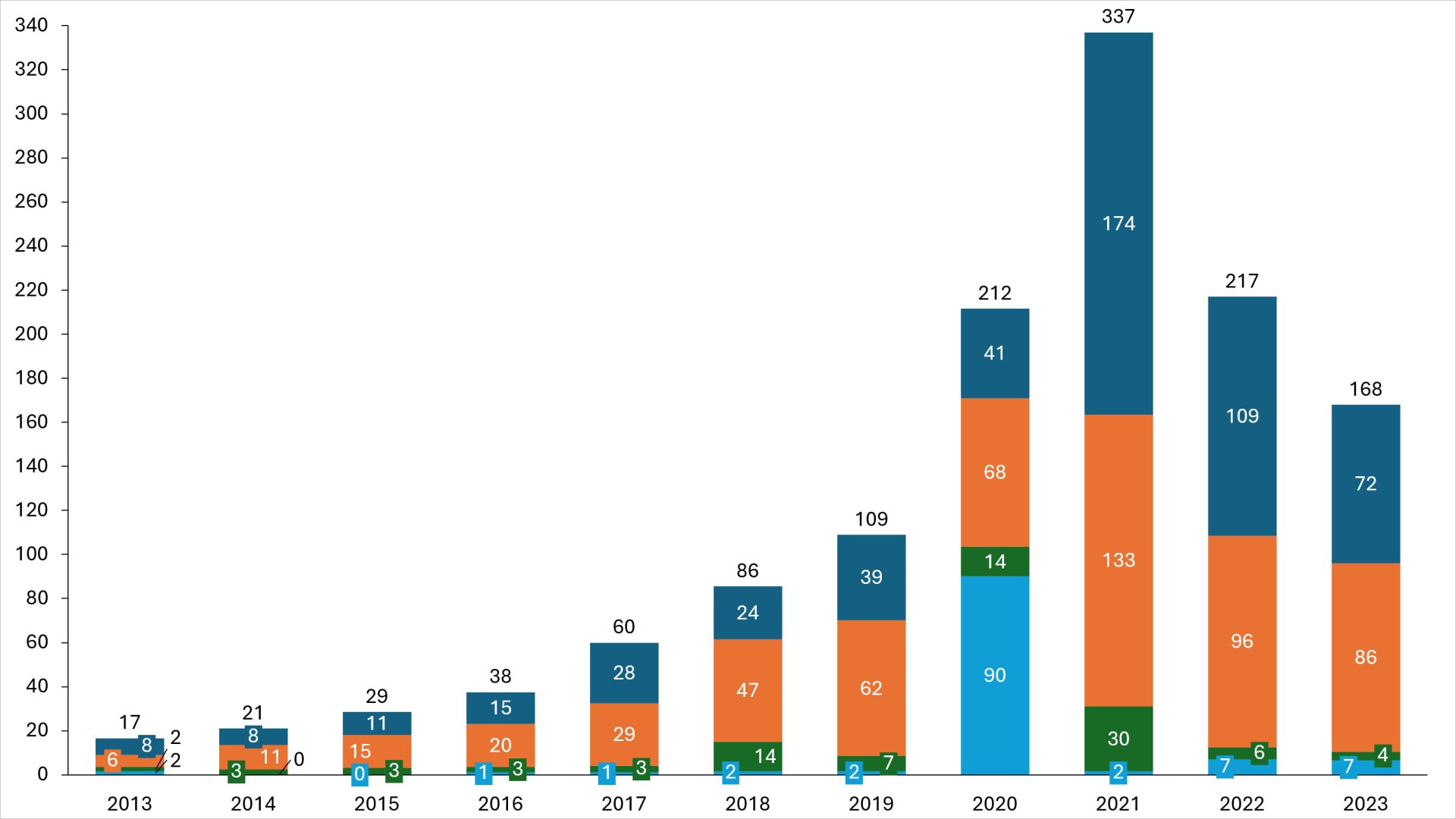
Source: Giattino et al. 2024. "Annual global corporate investment in artificial intelligence, by type." Our World in Data.
You can format and edit the updated chart just like any other think-cell chart.
5.6.2 Use the chart scanner in Excel
To scan an image and use the scanned data in an Excel sheet, follow these steps:
- In Excel, select the cell range where you want to insert the scanned data.
- Select think-cell > Data > Chart Scanner
- Move and resize the chart scanner window so that the capture area contains the image you want to scan. Include only the chart area, axes, and labels. Keep headers, references, and explanations outside the capture window.
- Wait for the chart scanner to finish scanning. When the chart scanner finishes scanning, it outlines the chart segments in red and the chart baseline in green, and enables the Paste Into Excel button.
- To rescan the image, move or resize the chart scanner window. If the chart scanner can't scan your image accurately, inform think-cell support by selecting Report Bad Scan.
- To insert the scanned data into your Excel sheet, select Paste Into Excel. The Excel sheet updates to reflect the new data. Close the chart scanner.
You can analyze the data in Excel or link it to a think-cell element in PowerPoint. To learn more, see 22. Excel data links.
Charting
-
4.Introduction to charting
-
5.Data entry
- 5.1
- Internal datasheet
- 5.2
- Absolute and relative values
- 5.3
- Transposing the datasheet
- 5.4
- Reverse order in datasheet
- 5.5
- Edit data layout
- 5.6
- Chart scanner
-
6.Text labels
-
7.Column, line, and area chart
-
8.Chart decorations
-
9.Waterfall chart
-
10.Mekko chart
-
11.Pie and doughnut chart
-
12.Scatter chart and bubble chart
-
13.Gantt chart (timeline)


