3. Basic concepts
This chapter presents the basic concepts that apply to working with think-cell elements.
- 3.1
- The think-cell ribbon in PowerPoint
- 3.2
- Insert elements
- 3.3
- Select objects
- 3.4
- Format and style elements
- 3.5
- Arrange objects
- 3.6
- Resize objects
- 3.7
- Zoom and pan
3.1 The think-cell ribbon in PowerPoint
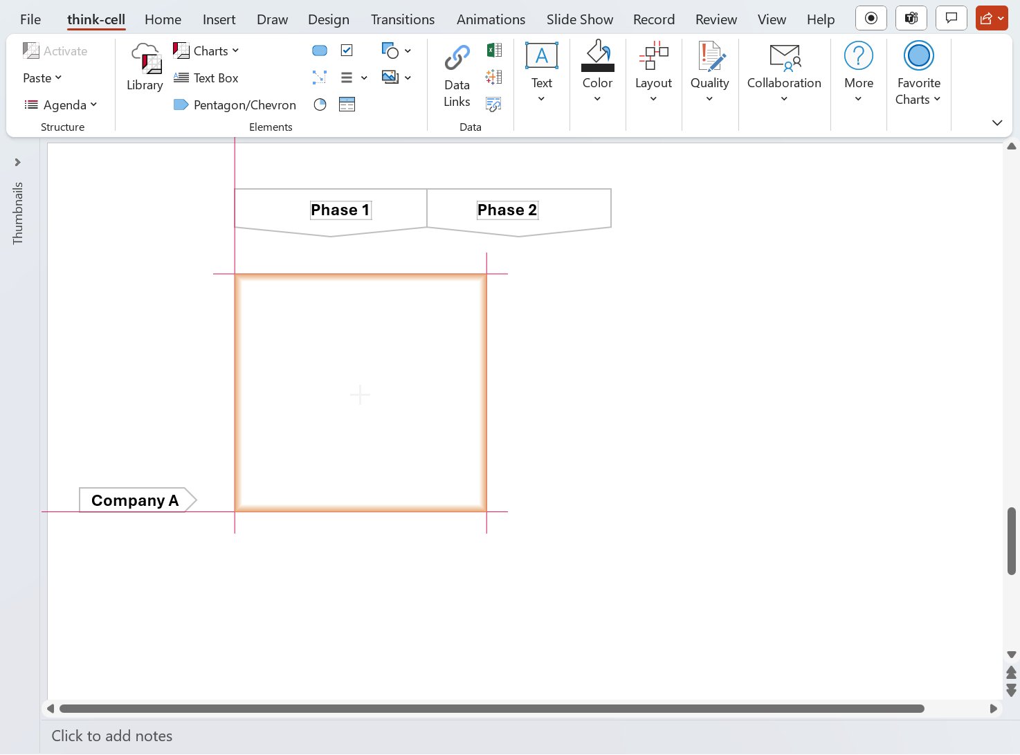
After installing think-cell, you can use think-cell commands on the PowerPoint ribbon.
The think-cell ribbon tab contains think-cell and PowerPoint commands organized from left to right to reflect the process of creating a presentation.

If you don't see the think-cell tab, your organization may have its own ribbon configuration and can provide related support. In many cases, you can go to Insert > think-cell to find frequently used think-cell commands. The Design, Review, and Help tabs may also contain think-cell commands.

The think-cell tab contains the following groups.
|
Group |
Description |
More information |
|---|---|---|
|
Structure |
Manage presentation agendas |
|
|
Elements |
Insert think-cell elements, including library content, charts, and shapes |
|
|
Data |
Manage data sources from Excel and Tableau |
|
|
Text |
Format text and insert symbols |
|
|
Layout |
Arrange, resize, and set automatic layout for objects |
|
|
Color |
Format text and shape color |
|
|
Quality |
Clean up and sanitize presentations |
|
|
Collaboration |
Share presentation slides |
|
|
More |
Access think-cell video tutorials, the user manual, the knowledge base, and version information |
You can customize the think-cell ribbon in PowerPoint. For more information, see the following topics:
- Customize the think-cell tab (Windows only)
- Remove the think-cell tab
- Customize the ribbon in Office (Microsoft Support)
If you can't find think-cell in PowerPoint, see KB0004.
3.2 Insert elements
You can insert elements using the think-cell tab or the Elements menu on the Insert tab.
The user manual provides detailed information about using think-cell elements. Use the table below to jump to a section.
|
Icon |
Element name |
Section in manual |
|---|---|---|
|
|
Library |
|
|
|
Column or bar chart |
|
|
|
100% column or bar chart |
|
|
|
Clustered column or bar chart |
|
|
|
Build-up waterfall chart |
|
|
|
Build-down waterfall chart |
|
|
|
Mekko chart with units |
|
|
|
Mekko chart with %-axis |
|
|
|
Area chart |
|
|
|
Area chart with %-axis |
|
|
|
Line chart |
|
|
|
Combination chart |
|
|
|
Pie chart |
|
|
|
Scatter chart |
|
|
|
Bubble chart |
|
|
|
Project timeline or Gantt chart |
|
|
|
Text box |
|
|
|
Pentagon/Chevron |
|
|
|
Rounded rectangle |
|
|
|
Harvey ball |
|
|
|
Checkbox |
|
|
|
Table |
|
|
|
Stock image |
|
|
|
Universal connector |
|
|
|
Shapes |
PowerPoint objects |
|
|
Images |
PowerPoint images |
Inserting an element into your presentation is very similar to inserting a PowerPoint object. To create a new element on a slide, select the required element from the Elements menu. To select rotated and flipped versions of these elements, hover over the arrows at the edges of the element button.
If you unintentionally select an element, you can do the following:
- Press Esc to cancel the insert operation.
- Select a different element.
Once you've chosen an element, a rectangle appears on the slide, indicating where the element will be inserted. There are two ways to place the element on the slide:
- Click once to place the element with the default width and height.
- Click and drag to create a custom-sized element. Some elements have a fixed width for insertion; in this case, you can only alter the height. You can always change the size of the element later.
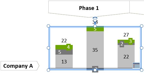
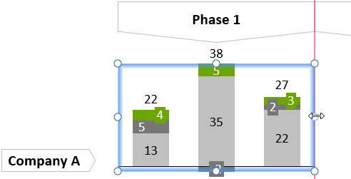
- With snapping, objects can be quickly and easily aligned. The highlighting of a border of some other object on the slide indicates that the element you are moving is currently aligned with that object.
- When resized, some elements snap to an automatically determined and predefined preferred size. In the case of a column chart, for example, its preferred width depends on the number of columns. If you have manually changed the size of an element, you can easily change it back to the default width. It will snap when you come close enough to the default while adjusting the width with the mouse.
As in PowerPoint, you can hold down the Alt key to move the mouse freely without snapping.
3.3 Select objects
3.3.1 Select think-cell elements and features
think-cell’s elements often contain individually selectable parts that we call features. For example, a chart element consists of the segments corresponding to the values in the datasheet and may also contain labels, axes, difference arrows, connectors and so forth.
You can distinguish a feature by the orange frame that appears when the mouse pointer is over it. When you click it, the frame turns blue to mark it as the currently selected feature. Additionally a mini toolbar might appear. It contains a set of property controls you can use to give the feature a different look. It is a good idea to explore a newly-inserted element to get an overview of the features it is made of and their properties.
When you right-click on a feature, its context menu appears. You use it to add additional features to the element or remove those currently visible.
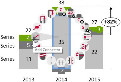

Buttons whose functions are unavailable for the current selection are greyed out. The context menu of the entire element is invoked by right-clicking the background of the element.
Features always belong to their respective elements and can themselves have further features. As an example, the vertical axis of a line chart is a feature of the chart itself, while the tick marks along the axis are features of the axis. Consequently you use the chart’s context menu to switch on or off the vertical axis and the axis’ context menu to toggle whether tick marks are shown.
There are several ways to remove a feature:
- Left-click the feature to select it and press the Del or Backspace key on your keyboard.
- Right-click the feature to open the think-cell context menu. Click the

- Open the think-cell context menu that you used to add the feature. Click the same button again to remove it.
Note: You cannot remove data segments from a chart element in this way. All data segments shown are controlled by the internal datasheet. If you delete a cell from the internal datasheet, the corresponding data segment is removed from the chart element.
Note: Buttons which toggle the presence of a feature, e.g. if series labels are shown in a chart or not, change their state accordingly. For example, after you have chosen 

Detailed information on all the available features is provided in the following chapters accompanying the respective elements they apply to.
3.3.2 Select elements with your keyboard
If you have already selected an object, you do not need the mouse to select a different object. Instead, you can hold down the Alt key and use the arrow keys ← → ↑ ↓ to select a different object.
When a PowerPoint shape or think-cell element is selected, Alt with arrow keys selects the next shape found in the arrow’s direction.
When an element’s feature is selected, Alt with arrow keys selects the next feature of the same type in the element. You can only select a new feature within the same element. To select features of another element, you have to first click on the element.
3.3.3 Select multiple objects
Within a think-cell element, you can quickly select a range of features of the same type using the Shift or Ctrl keys, similarly to selecting files in Microsoft Windows Explorer. This is called logical multi-selection.
Logical multi-selection is particularly useful if you want to colorize an entire data series in a chart element, or if you want to change the formatting of a range of labels. You can even use multi-selection to paste text into multiple labels at once (see 6.6 Pasting text into multiple labels).
To select a range of objects with the mouse, click and drag an area selection frame around the objects.
To select a range of features within a think-cell element using the keyboard, click on the first feature in the desired range, then hold down Shift and click the last feature in the range. When you move the mouse while holding down Shift, the range of features that is going to be selected is highlighted in orange. You can also use Shift + click to select a range of objects, including a mix of think-cell elements and native PowerPoint objects.
You can use Ctrl + Alt + Shift + ← → ↑ ↓ to extend the current selection to multiple features of the same kind or to multiple objects, including both think-cell elements and native PowerPoint objects.
To add single features to the selection, or to remove single features from the selection, hold down Ctrl while clicking. Again, this is the same way multi-selection works with files in Microsoft Windows Explorer.
Pressing Ctrl+A repeatedly will successively increase the size of a selection of features of the same kind. For example, when you select a segment label of a stacked column chart, first all segment labels of the same data series, then all segment labels of all series in the chart, and finally all labels in the chart are selected. Similarly, when a chart segment has been selected, first all segments of the same series, then all segments of the chart, then all segments of all charts on the same slide are selected.
3.3.4 Reference object
If you select multiple objects on a slide including a think-cell element, you can set any of these objects as the reference object. The reference object has a red dot at its center. Hover over an object until you see the red dot, then click the object to set it as the reference object.
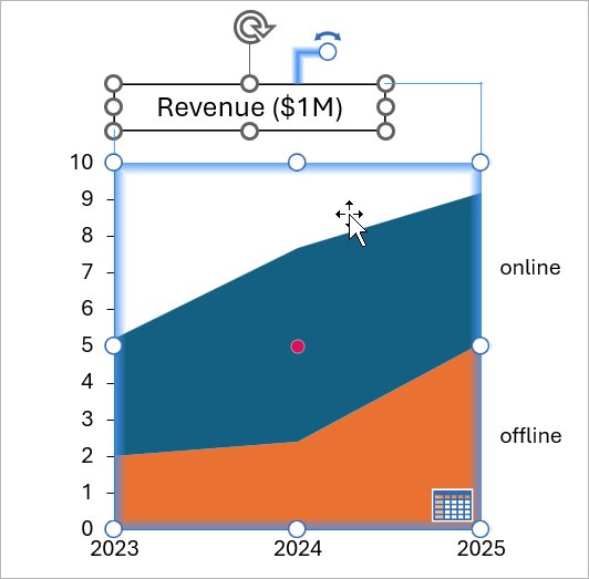
You can then align the position of the selected objects in relation to the reference object (see 3.5.1 Align objects), or you can match the width or height of the selected objects to the reference object (see 3.6 Resize objects).
You can set the reference object to any PowerPoint object or think-cell element in a multi-selection by clicking on it. Which object in a multi-selection initially serves as the reference element, as indicated by the red dot, depends on how you add to the selection:
- Shift+click, Ctrl+Alt+Shift with arrow keys (see 3.3.3 Select multiple objects), or Ctrl+A leaves the reference object where it is.
- A mouse click or Ctrl+click sets the reference object to a new object.
- If you create a multi-selection by dragging a selection frame over multiple objects or by pressing Ctrl+A without first selecting an object, initially there is no reference element.
To align objects to the reference element, make sure that Align Selected Objects is selected in PowerPoint’s Align menu, then choose the desired alignment option (see 3.5.1 Align objects).
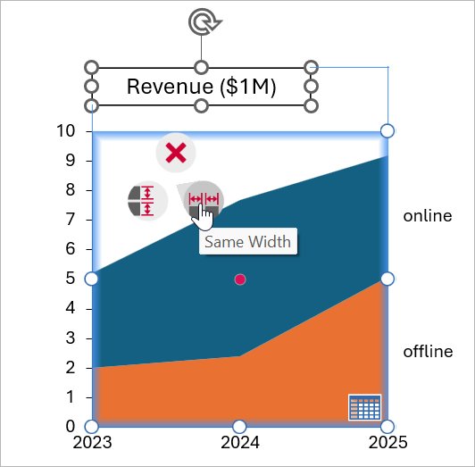
To resize objects, right-click on the object you wish to use as the reference element in the multi-selection to open the object’s context menu. Select Same Height or Same Width.
3.4 Format and style elements
When you select an element or feature by clicking on it a mini toolbar might appear. It contains property controls to change the look of the feature. Only the controls which are applicable to the selected feature are shown in the mini toolbar.
In this chapter several general types of controls are described. Through the course of the following chapters, detailed information is provided for all property controls of the mini toolbar in the context of specific element and feature types.
3.4.1 Color and fill
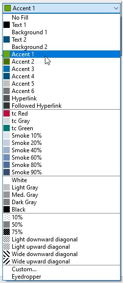
The color control applies to features that have a fill color, to lines including outlines, arrows and connectors (see 8.2 Arrows and values), and to font color (see also 6.5.2 Font color).
For fill colors, the list contains Use Datasheet Fill if you have enabled Use Datasheet Fill on Top in the color scheme control (see 3.4.2 Color scheme). To reset the fill color of a segment you colored manually choose Use Datasheet Fill to use Excel’s cell formatting.
If you need other colors than offered by the color control, select the Custom option from the dropdown box. You will then be presented with a color picker where you can choose any color you like; the color you select will immediately be applied to the selected element on the slide, so you can easily judge the result without having to close the dialog.
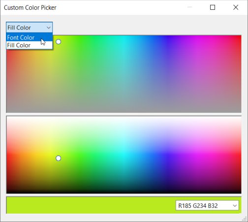
You can select an RGB color specified in either hex (#82a617) or decimal (rgb(130, 166, 23) or R119 G119 B119) format by entering it into the box bottom right.
The dropdown menu top left lets you easily switch to choosing the color of other features of the selected element. You can also easily switch to selecting a custom color for a different think-cell element by selecting it on the slide.
think-cell adds the most recently used custom colors to the color control for quick access. You will find a divider line in the list of most recently used colors: The colors above the divider are saved within the presentation, so you can rest assured that your colleagues have them available when editing the presentation. The colors below the divider are available on your computer only, because you were using them in a different presentation. Both sections can hold up to 8 colors. When you use a 9th custom color, the first one is removed from the list.
You should use the color property when highlighting specific segments or one series in a chart. If you need to colorize an entire chart, use the color scheme property instead.
3.4.2 Color scheme
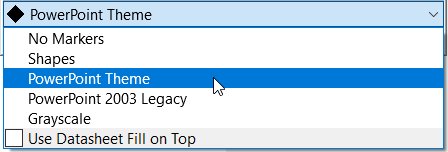
Pick a color scheme that applies a sequence of colors to chart features. By default, think-cell elements use the PowerPoint Theme color scheme. To change the color scheme of a chart, select the chart to open the mini toolbar, select the color scheme dropdown menu, then select the color scheme you want. The colors in your chart will automatically update when you add or remove data.
The color scheme applies colors in sequence: the first color of the color scheme applies to the first feature in the chart and the sixth color applies to the sixth feature. The default think-cell color schemes have six colors in sequence. The color sequence resets after applying the last color: using the default color schemes, the seventh feature on your chart will use the first color of the color scheme.
Note: You can customize the number of colors in a color scheme and the color scheme behavior when there are more features in a chart than there are colors in a color scheme. To learn more, see D.4.2 Choices in the color scheme control.
Use datasheet fill colors on your charts
You can use your datasheet to control the colors of your charts. To apply the cell fill colors of your Excel datasheet to your chart in PowerPoint, select your chart to open the mini toolbar, select the color scheme dropdown menu, then select Use Datasheet Fill on Top.
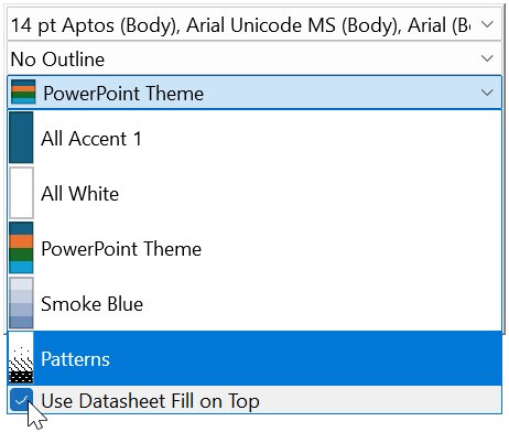
Use Datasheet Fill on Top is particularly convenient if you want to highlight patterns and trends in your data through the Excel datasheet. In most charts, selecting Use Datasheet Fill on Top applies the fill color of a cell containing a value to the corresponding feature in the chart—with two exceptions:
- In area charts, the fill color of a cell containing a series label determines the corresponding area's color in the chart.
- In line charts, the fill color of a cell containing a series label determines the corresponding line's color in the chart. The fill color of a cell containing a value determines the corresponding marker's color in the chart. To learn more, see 3.4.8 Line scheme and 7.4 Line chart.
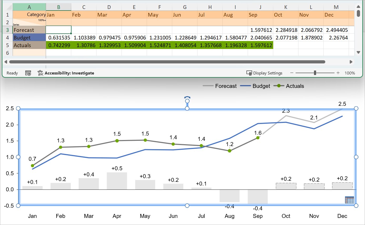
If you enable Use Datasheet Fill on Top and a feature in your chart corresponds to a cell without a fill color, think-cell applies the selected color scheme in PowerPoint to that feature.
Use conditional formatting to color your charts
You can use Conditional Formatting in Excel to change the fill color of your chart features, to have additional color control based on specific data trends. To apply cell fill colors to your chart based on conditional formatting, follow these steps:
- Select a range of cells, a table, or an entire sheet in Excel. These cells may contain any values, formats, formulas, and references to other cells.
- Select Home > Styles > Conditional Formatting or think-cell > Styles > Conditional Formatting.
- Select one of the preset Greater Than, Less Than, Between, and Equal To formatting rules. Enter your parameters in the dialog, then select OK.
- If you want to create custom formatting rules, select New Rule > Format only cells that contain > Cell Value. Enter your parameters in the dialog, then select OK.
- Select the linked chart in PowerPoint to open the mini toolbar, select the color scheme control dropdown menu, then select Use Datasheet Fill on Top.
Using conditional formatting rules to affect chart colors has the following limitations:
- Only the Greater Than, Less Than, Between, and Equal To preset rules affect chart colors.
- Only the custom rules created with New Rule > Format only cells that contain > Cell Value affect chart colors.
- Rules with functions or references to other cells don't affect chart colors.
- You can't use conditional formatting to change the number format of your charts. To change the number format of your charts using a linked Excel sheet, select the cells, then right-click and select Format Cells. To learn more, see 6.5.3 Number format.
- think-cell can't automatically update chart colors after you create or change conditional formatting rules in a linked Excel sheet. To update the chart, change any data value on the linked sheet or save your progress and restart Excel.
To learn more, see 22. Excel data links.
3.4.3 Segment sorting

The segment sorting control applies a specific order to the segments in a chart. The default Segments in sheet order orders segments in the same order they appear in the datasheet. If you choose Segments in reverse sheet order the last series in the datasheet will be displayed at the top of the chart and the first series in the datasheet at the bottom of the chart.
think-cell can also sort the segments in a category based on their value. Segments in descending order will sort all categories so that the largest segment in each category is on the baseline and sort the other segments in descending order, Segments in ascending order will display the segment with the smallest numerical value on the baseline. As a consequence of sorting, segments of the same data series, with the same color, will appear at different positions in different categories.
Of course, these options are only available for charts that have segments. The options shown here apply to segments of column and bar, pie and doughnut, as well as Mekko charts. For area and waterfall charts only the options relating to sheet order are available.
3.4.4 Category sorting

The category sorting control applies a specific order to the categories in a chart. The default Categories in sheet order orders categories in the same order they appear in the datasheet. Categories in descending Y extent order will show the category with the greatest sum of values first and then sort in descending order. Categories in ascending Y extent order will show the category with the smallest sum of values first and then sort in ascending order.
The options shown here apply to stacked or clustered column and bar charts, line and area charts, as well as Mekko charts. For each chart type, sorting options appropriate to that particular type are offered.
3.4.5 Chart type

The chart type control switches to a different chart type for displaying the same data. You can switch between the stacked, stacked 100%, clustered, area, area 100% and line chart.
When using only columns or bars on an absolute axis and lines, you can also switch individual series to a different type, creating a combination chart, by selecting a segment or data point belonging to that series and switching the chart type in the mini toolbar.
To switch to a 100% chart of the same basic type you can also set the Y-axis type to % (see Adjusting the value axis type).
3.4.6 Line style

The line style control applies to the outlines of segments of column, bar and pie charts, basic elements, agenda chapters, lines in line charts, a chart’s baseline and to value lines (see 8.2.4 Value line). You can also change a connector’s appearance using the line style control. In addition, the outline of the plot-area in all charts can be specified using the line style control.
3.4.7 Outline colors
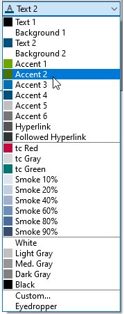
You can change the color of an outline with this control. It works for segments of column, bar and pie charts as well basic elements and agenda chapters.
3.4.8 Line scheme
The line scheme control specifies the appearance of lines in line charts. The supported line schemes apply consistent line styles and coloring to all lines in the chart. You can also choose line schemes that highlight the data points along lines with markers.
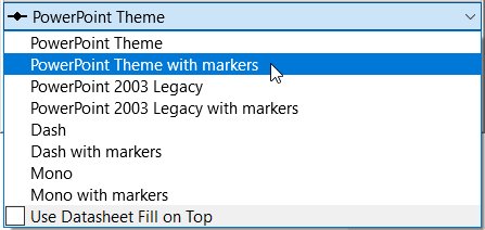
3.4.9 Marker shape
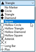
The marker shape control can be used to add or change markers for data points in line and scatter charts. Note that the marker scheme control should be used instead of marker shapes to add consistent markers to all the data points in a scatter chart.
3.4.10 Marker scheme
The marker scheme control applies consistent markers to data points in scatter charts. The markers are automatically updated when data points, groups and series are added or removed. The marker scheme control should be preferred over the marker shape control when adding consistent markers to an entire scatter chart.
3.4.11 Changing default colors and fonts
think-cell can use PowerPoint’s scheme colors for many elements and features (e.g. axes, text, arrows, etc.). These colors as well as font definitions are always taken from the default colors and fonts of your presentation file. If the defaults are designed correctly, think-cell will follow seamlessly when you choose to switch the color scheme.
To adjust the default (font) colors and font family, change your theme in the Design tab. think-cell elements will use the font family chosen for Body text by default. If the desired color scheme or font family is not already available as an option, you can add it as follows:
For Office 2010:
- In the ribbon, go to Design.
- In the group Themes, click on Colors/Fonts.
- From the dropdown list, choose Create New Theme Colors/Fonts.
For Office 2013 and later:
- In the ribbon, go to Design.
- In the group Variants, click on the downward button in the bottom right.
- From the dropdown list, choose Colors/Fonts, then Customize Colors/Fonts.
In general, it is advisable to store these defaults in a PowerPoint template file (*.potx) and to derive all new presentations from this template file. Please refer to the PowerPoint help for information on how to do this.
You can also specify default and additional color schemes for charts, as well as default font colors, using a think-cell style as described in C. Customizing think-cell. The specific settings for font colors are described in D.6 Customizing text properties. It is preferable to adjust default font settings in the PowerPoint template and a think-cell style should only be used for this purpose as a last resort, when you cannot modify your template as described above.
3.5 Arrange objects
3.5.1 Align objects
You can use PowerPoint's familiar controls, for example those found in the Home > Drawing > Arrange menu, to position think-cell elements on the slide.
In particular, you can use the Align Left/Center/Right/Top/Middle/Bottom buttons to align one or more selected elements in relation to the slide or in relation to each other. For think-cell elements that are layout-enabled (see 14. Introduction to layout), this does not merely position them accordingly, but also introduces a snap connection between them that keeps them aligned along that edge or axis, even when they change their size or position on the slide (see 15.1 Inserting and snapping text boxes for more information).
When the Align Selected Objects option is chosen in the Arrange menu, PowerPoint will natively align the left/right/top/bottom edge of all selected elements with that of the outermost selected element in that direction, or align their center/middle axis with that of the rectangle bounding the selection. In particular for Align Center/Middle this is often undesirable, as it means that in many cases all selected shapes will be moved, and the center/middle axis of the bounding rectangle of a selection of unaligned shapes usually has no meaning in the slide layout.
As soon as at least one think-cell element is part of your multi-selection, think-cell improves upon this by using the reference object as the alignment target: When performing an alignment operation with Align Selected Objects, the chosen edge or axis of the other selected elements are aligned with the corresponding edge of the reference object (see 3.3.4 Reference object). A reference object that has a fixed position will therefore not be moved by the alignment operation.
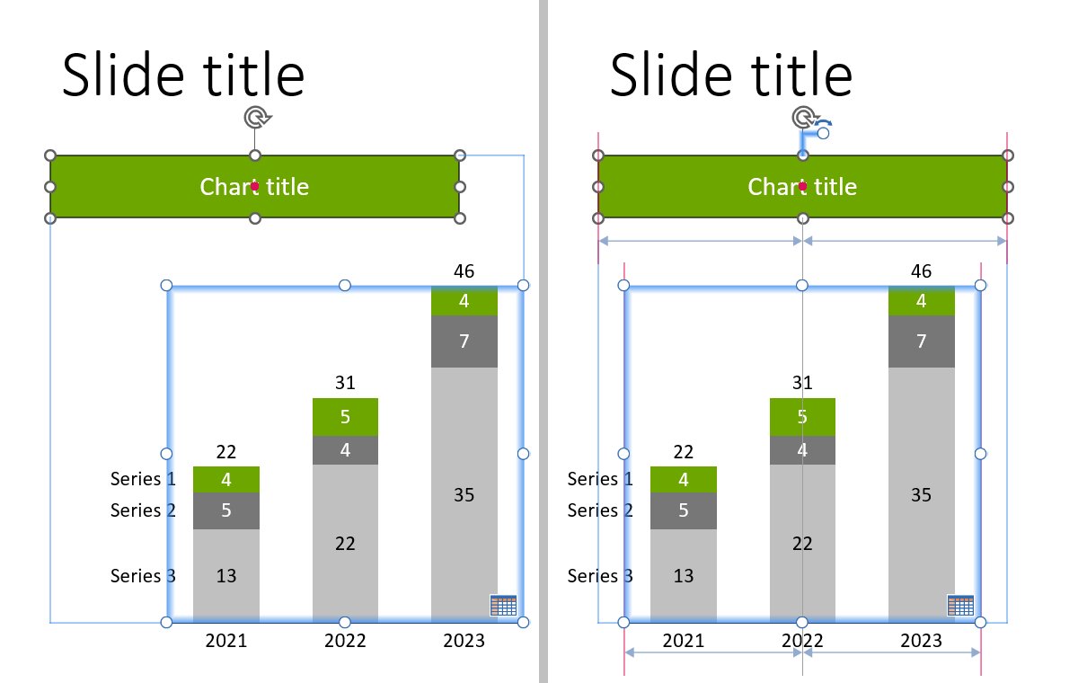
If a multi-selection containing a think-cell element has no reference element set, the alignment behavior is the native PowerPoint behavior described above.
3.5.2 Rotate and flip elements
In the Elements menu, the small arrow markers around the pentagon/chevron and the stacked, clustered, 100%, line, combination, area, waterfall and Mekko chart symbols let you insert flipped (and—if applicable—rotated) versions of these elements.
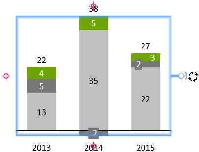
Most elements can also be rotated after insertion using a rotation handle. Simply select the element and drag the rotation handle to the desired position: Click with the left mouse button on the rotation handle and, while holding the button down, drag the handle to one of the four possible red-highlighted positions and release the button.
3.6 Resize objects
When an element is selected, resize handles are shown at the corners and in the center of the boundary lines. To resize an element, drag one of these handles.
While dragging the resize handle, you can press PageUp and PageDown or scroll with the mouse wheel to switch to a different slide. The outline of the element you are resizing will appear in gray, and you can use shapes on that other slide as reference points, with the same snapping behavior as explained in 3.2 Insert elements. When releasing the mouse button, you will be taken back to the original slide, where the selected size will be applied to the element. This makes it easy to align elements' positions and sizes across slides.
You can also set two or more elements to the same width or height. This also works if you include PowerPoint shapes in your selection. First, select all objects that you want to set to the same width or height (see 3.3.3 Select multiple objects). Then, choose 

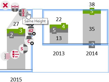
3.7 Zoom and pan
When editing a slide in a zoomed view (like 400%) it is often hard to move the slide around and locate the region that you want to work with next. With think-cell installed, you can use the middle mouse button to “pan” the slide: Just grab the slide with your mouse pointer by clicking the middle mouse button and move it where you need it.
If your mouse has a wheel instead of a middle button, you can achieve the same effect by pressing down the wheel without turning it.
Note: You probably know that in PowerPoint you can zoom in and out using the mouse wheel with the Ctrl key held down. Together with the panning feature from think-cell, using zoomed views for slide design becomes easy and fast.


