The importance of data visualization for business decision-making
- Home
- Resources
- Content hub
- The importance of data visualization for business decision-making

18 min read — Amos Wong
Data visualization is an important tool for businesses because it speeds up decision-making. Faster decisions mean faster results, and an MIT study found that our brains can process images we’ve seen for as few as 13 milliseconds. Decisions don’t need to be made quite that quickly, but if businesses can ingest the vital information faster, they have more time to focus on evaluating options and drawing the right conclusions.
Creating a data visualization to aid the decision-making process involves more than just turning a table into a column chart. It’s important that you select the right data, choose the right type of chart, remove any distractions, and present the visualization in a way that focuses the decision-makers’ attention on what matters most. Poorly constructed charts can create confusion and lead to poor business decisions.
This article has three main aims:
- Demonstrate the core benefits of data visualization for business
- Present examples of how different data visualizations can support different business scenarios
- Provide a five-step guide to building effective data visualizations
think-cell is the leading data visualization software for PowerPoint. You can download a free trial and see how easy it is to create impactful charts to support your arguments and drive decision-making:
The benefits of data visualization in business
Good data visualization makes it easier to understand the story behind a dataset. The following chart shows how this work, using a difference arrow to highlight the most relevant datapoint and shape the narrative.
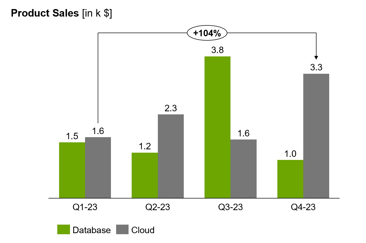
Even for a simple column chart with just eight distinct datapoints, trying to describe the data without a visualization would need a few paragraphs and still not be able to communicate the insights nearly as clearly. You can expand the text below to see how extreme this can be.
Text description of data. Click to expand.
The data presented showcases the performance of two products, database and cloud, across four distinct time periods: Q1-23, Q2-23, Q3-23, and Q4-23. In Q1-23, the database product recorded a value of 1.5, while the cloud product achieved a higher value of 1.6.
As we move to Q2-23, the database product shows a decrease to 1.2, while the cloud product demonstrates a substantial rise to 2.3. Moving forward to Q3-23, we observe a massive improvement in the database product with a value of 3.8. However, the cloud product experiences a slight decline to 1.6.
Finally, in Q4-23, the database product registers a value of 1.0, while the cloud product significantly recovers and reaches a high value of 3.3. Comparing the performance of the cloud product between Q1-23 and Q4-23, the cloud product demonstrates an impressive percentage increase of 104%.
The benefits of data visualization are near-universal, with clear communication and powerful storytelling playing an important role in education, journalism, or entertainment. But in business, clarity matters more than anywhere else. In business, clarity is money. Without it, businesses see friction in their decision-making, which drives down productivity and negatively impacts revenue.
Let’s look at five key benefits that show why data visualization is so important for business decision-making.
Focus: Identify powerful levers through data analysis
Part of building a data visualization is making decisions about which data to highlight and which story you want to tell. This process helps you identify patterns, trends, and the most impactful levers that wouldn’t necessarily be visible in a table. When you emphasize what matters in your data visualization, you have a clear narrative and a direct path to an impactful decision.
Transparency: Communicate the rationale behind business decisions
Well-constructed visualizations create an unambiguous view of the data and the argument you want to make. This helps everyone understand the rationale behind business decisions, which strengthens buy-in across teams. The best data visualizations can be easily understood without the need for a presenter, so they can be shared in the company and serve as transparent documentation of the decision-making process.
Productivity: Maximize the impact of everyone’s work
The better the data visualization, the more efficiently teams operate because everyone’s time is used productively. An analyst’s work is more impactful if their findings are well presented and contribute to business decisions. And an executive’s time is more productively spent if they can get the relevant facts quickly and focus on decision-making.
think-cell doesn't just boost your productivity when making data visualizations. With think-cell Tools, you can automate a wide range of tedious PowerPoint tasks and save time on every slide you make. Try them today by downloading a free trial:
Speed: Make important business decisions faster
Not every business decision can be made quickly. Nor should it. Analyzing multiple scenarios, balancing different interests and forecasting possible outcomes is essential for making informed decisions that will help a business succeed. Making complex decisions can take time, but there is one aspect you always streamline. By using powerful data visualizations to communicate insights, you avoid one bottleneck and speed up the overall decision-making process.
Culture: Take more data-driven decisions
Quite simply, companies that have a culture of data visualization will base more of their decisions on data. Which means more of their decisions are likely to drive the business forward. If the story behind a dataset is unclear or it takes too long to understand, decision-makers will often act based on intuition, rather than evidence. Which means their decisions won’t always lead to the best possible outcomes for the business.
Examples of data visualization for business decision-making
This section looks at five examples of specific kinds of data visualization and how they can be used to drive decision-making in different business scenarios.
Mekko charts for visualizing revenue share data
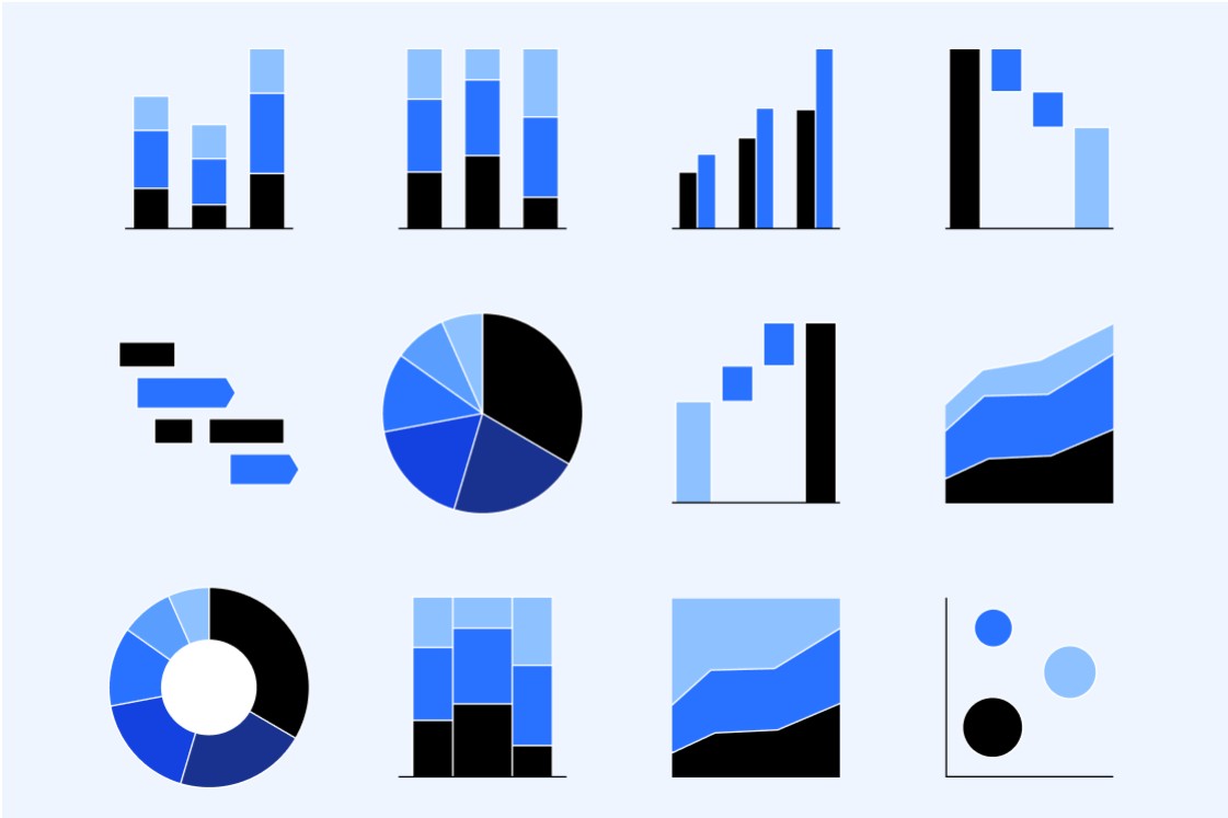
Mekko charts, also known as Marimekko charts, make use of column width to provide information not available on column charts. This makes Mekko charts well-suited to presenting market or revenue share data, as they can show percentages on the y axis, while also showing the volume of different regions or business units. Without a Mekko chart, a decision-maker could overestimate the significance of a high percentage growth rate in a region that makes a relatively small contribution to the overall business.

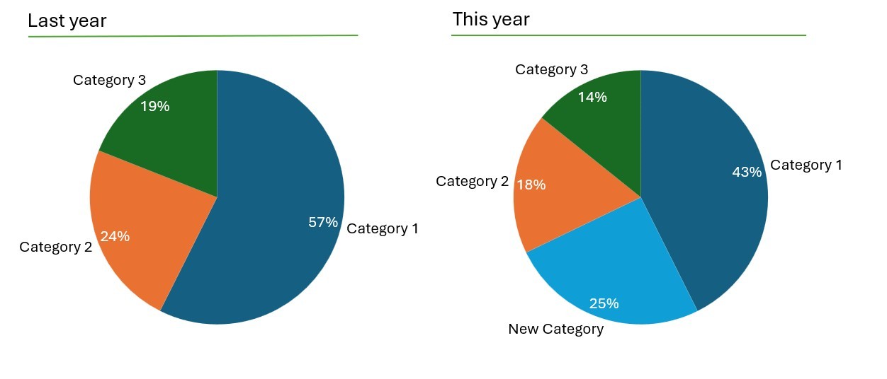
Pie charts for easily-consumable data visualizations
Pie charts aren’t suited to every kind of dataset, but for a limited number of categories that make up a relevant total, they can’t be beaten for ease of consumption. Because they’re so recognizable, pie charts can help quickly set the scene before diving into more complex visualizations for finer analysis. Pie charts are also useful for evaluating the impact of a significant change with a before/after comparison.
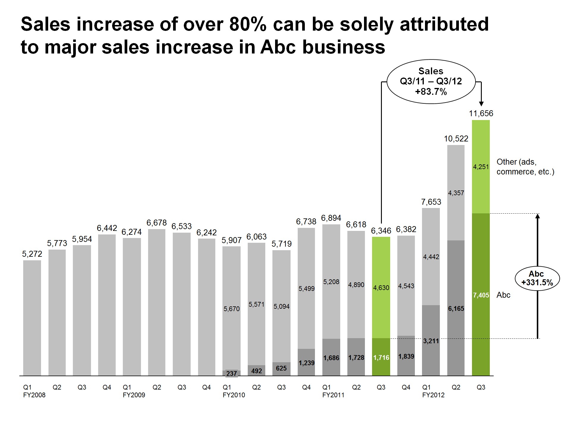
Column and bar charts for visualizing business reports
Column charts are often used in recurring monthly reports to show the performance of different regions, channels or business units. While it’s easy to simply update the data, a small amount of formatting can turn a regular column chart into a powerful data visualization. By highlighting the most important column or adding an insightful difference arrow, updating your report becomes more than a box-ticking exercise and can contribute to meaningful business decisions.
Waterfall charts for telling a story with your data visualization
Waterfall charts can support business decisions by illustrating how each contributing factor impacts a final result. Waterfall charts are unfamiliar to some, and they aren’t easy to build in PowerPoint, but their unique ability to tell a story makes them a staple of decision-making for a range of business contexts and industries.
Gantt charts for visualizing project timelines
Unlike other charts that visualize business data like revenues, sales, or market shares, Gantt charts are used to display project timelines. But they’re no less important for driving business decisions. A clear timeline is a must-have for any project manager who has to set priorities, communicate decisions transparently, and hold stakeholders to account.
PowerPoint and Excel don’t offer data-driven Gantt charts, which is why a lot of project managers work with a solution like think-cell. You can download a free trial to try out think-cell’s Gantt charts for your project timelines.
5 steps to visualizing business data effectively
This section focuses on how to build a powerful data visualization within a business presentation. For look at the whole process, you can also read our article on how to create a great PowerPoint presentation.
Building an effective data visualization can be broken down into five steps.
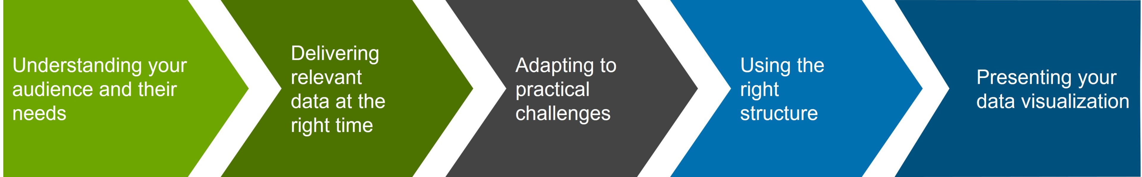
Step 1: Understanding your audience and their needs
Whether you’re presenting your visualization to someone in supply chain, strategy, R&D, HR, IT, or even your CFO, always consider how much context they need to understand your story, and what unnecessary details you can eliminate.
In general, it’s better to be concise, but some audiences may appreciate some additional background that supports your key points. Similarly, more technical details might help you raise your credibility and win you trust with some audiences, whereas decision-makers will be more focused on the bottom line.
Understanding your audience will help you craft coherent narratives and convincing arguments. By focusing on relevance, you maximize the impact of your data visualizations and increase the chances of reaching positive business decisions.
Step 2: Delivering relevant data at the right time
One thing all business decision-makers have in common is that they value their time. If your CEO is giving you half an hour to present, then you want to respect their time by sharing clear visualizations that are relevant to the decisions they are currently facing.
Focusing on what’s most relevant isn’t always easy when you’ve been working on complex issues with multiple influencing factors. One approach is to break down your story into bite-size chunks. If you have a chunk that doesn’t contribute a valuable message, you probably don’t need to make a data visualization for it.
Also think about timing. For example, it might make sense to provide an overview of total sales early in the quarter, and more detailed breakdowns by brand, category or territory later on. Thinking about the decisions you are hoping to support can help inform which data is most relevant, and when.
A strategic approach will make the communication process smoother and your visualizations more effective. Let your decision-makers knows what to expect from your presentation, including which data you are going to share. This will create a receptive, productive environment that is geared towards better decision-making.
Step 3: Adapting to practical challenges of working with data
Before choosing which chart type to use to communicate your message most effectively, there are a few practical aspects of data preparation that you need to consider:
- Availability: Which relevant data exists and which formats is it available in?
- Accessibility: How can how the data be obtained? Does the team have relevant access and are there incremental costs from licensing, subscription fees or training to use the software? Are specific authorizations required?
- Time constraints: How long will it take to gather the data, clean it and convert it into a meaningful visualization.
By adapting to real-life circumstances and making pragmatic choices, you can avoid frustration and ensure that you know from the outset the kind of data you will be working with. With practical issues resolved, you have more time to focus on preparing a visualization that will represent your data in the best possible way.
Step 4: Using the right structure for your visualization
Technology can be of great assistance throughout the entire process, from sourcing and compiling your data, to converting it into suitable visualization and presenting it. When choosing the right tools, you should consider whether your audience will be interacting with your visualizations directly, or consuming it as part of a presentation.
Data dashboards for self-service visualization
When your audience prefers to work with the data themselves, filtering and adjusting according to their specific needs, your data visualization should fulfil two main criteria:
- Valid information: Imagine a marketing manager who needs to evaluate the success of different advertising campaigns. If the data provided is inaccurate or outdated, the manager might make critical decisions based on flawed insights, leading to ineffective allocation of resources, and missed opportunities.
- A flexible tool: Consider a sales team working on a diverse portfolio of products and regions. A rigid reporting tool that cannot accommodate different data views or customize metrics may hinder their ability to analyze performance effectively.
Ad-hoc presentations for data storytelling
Often, it will be your role to analyze the data and present it to the decision-maker along with your recommendations. This is where you need an ad-hoc PowerPoint presentation with a clear narrative. You create the story and build the presentation, using the right visualizations to support your argument and providing all the necessary insights for making an informed decision.
If you’d like to learn more about creating dashboards and ad-hoc presentations from complex datasets, you can read our blog article on building data visualizations from pivot tables.
Step 5: Presenting your visualization to drive decisions
Once you’ve identified your audience, which data to work with, and the best structure for sharing it, the final step is presenting your data visualization in a way that will drive decisions.
All the work and effort invested in analyzing the data will be worthless if you don’t communicate it effectively. Data visualization is a subject you can fill degree courses with, but here are a few key points to consider that are particularly relevant when visualizing data in a business environment.
- Share accurate data: The best way of torching your credibility in an instant is to share inaccurate or inconsistent data. Make sure your data is up-to-date and doesn’t contradict itself. Ideally, your visualization should always be linked to your data source so that it’s always correct even if the data changes.
- Avoid information overload: Apply the “less is more” approach and the pyramid principle. Simplicity and minimalism are the essence of clear communication. Instead of overwhelming the audience with excessive data or lengthy content, focus on distilling information to its most important elements.
- Focus on your message: Internalize the main message of a visualization and remove any unnecessary information. Don’t hide important details, but if the global average will only distract from what you’re trying to say, take it out.
- Highlight what counts: Use colors selectively to highlight a specific column or datapoint you want to draw attention to. If you’re choosing something to highlight, follow through with it and make this the main message of your visualization. Don’t pick out one column and focus your annotations on something unrelated.
- Provide context: Add difference arrows, data labels and annotations where they are useful. Don’t overload your chart but do share valuable context with your audience to help guide their decisions.
- Double down on the details: If your chart has inconsistent number formatting or alignments, it distracts from what you’re trying to say. You maximize the credibility of your message if your charts look professional.
- Stay on brand: If your company uses a standardized set of colors and fonts, this is key part of their visual identity so stick to it. Even for internal business presentations, you’re representing your company and you make a professional impression by following guidelines and sticking to templates.
Drive business decisions with think-cell data visualizations
think-cell, the leading PowerPoint add-in for business presentations, has all the tools you need to build powerful data visualizations that will help drive faster, more effective business decisions.
You can see for yourself by downloading a free trial that gives you full access to all templates, chart types, and the complete range of think-cell features:
Two fun facts about data visualization
- Researchers from Cornell University found that if a scientific claim is presented in pure words or numbers, 68% of people will believe that the information is accurate and truthful. But if you put a simple graph with the claim, the number rises to 97%!
- The Wharton School of Business found that while only half of an audience was convinced by a purely verbal presentation, that number jumped to over two thirds when visuals were added.
Explore this topic further with AI:
Read more

Learn about the MECE principle and examples of how to apply it, plus how to use it to create stronger PowerPoint presentations faster.

Explore the think-cell Library and see how you can save time, search effectively, and access a wealth of resources to ensure you never have to start your presentation from a blank slide again.

This article runs through 7 tools that will speed up your PowerPoint work and help you build polished slides faster, without compromising on consistency.

Learn 7 steps for making an effective PowerPoint presentation, including how to structure your story, lay out your slides and create clearer, more impactful charts.
Discover more than 70 PowerPoint slide templates that help you get started faster and cover all the most common business presentation scenarios.