4. Introduction to charting
In this chapter, a step-by-step tutorial will show you how to create a chart from a scribble like this:
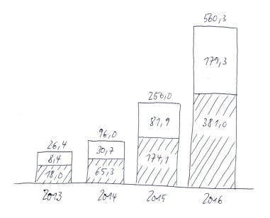
A more elaborate presentation of the basic concepts of think-cell and details on the various chart types can be found in 3. Basic concepts and in the following chapters.
Contents
4.1 Inserting a new chart
With think-cell installed, you will find the following group in the Insert tab of PowerPoint’s ribbon.
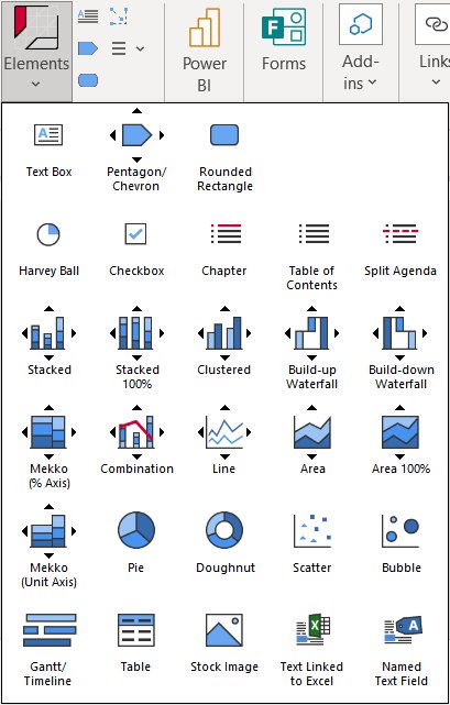
Inserting a chart into your presentation is very similar to inserting a PowerPoint shape. Go to the think-cell group and click the Elements button. Then, select the required chart type.
In our example, we want to insert a column chart, which is represented by this button: 
Once you have chosen a chart type, a rectangle will appear with the mouse pointer, indicating where the chart will be inserted on the slide. When you are inserting or resizing a chart, you will notice that it snaps to certain locations, aligning with existing objects on the slide.
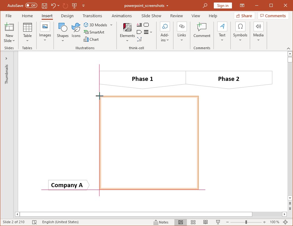
The chart is automatically selected after insertion, as indicated by a blue highlighted outline. If a chart you want to modify is not selected, you can select it by clicking on it.
4.2 Adding and removing labels
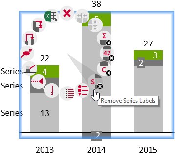
After inserting a new column chart, both category labels and series labels are shown automatically. There are several ways to remove and add labels. The easiest way to remove a single label is to select it and press the Del key. The easiest way to remove all labels of a particular type is to select the respective button from the chart’s context menu.
To remove the series label like in our example column chart, click 
4.3 Entering chart data
When you select the column chart, a datasheet button 
Click the datasheet button, or simply double-click the chart, to open the datasheet. The datasheet opens automatically after insertion of a new chart. Now, enter the data from our example column chart into the datasheet. Type in only the actual numbers. Do not round numbers or calculate totals—think-cell will do this for you. For most chart types, you can simply input the numbers the way you see them in the scribble, from left to right and from top to bottom. The tab key Tab can be used, just as in Microsoft Excel, to conveniently move to the next column in a row, and the enter key Enter can be used to jump to the first column of the next row.
The datasheet for our example column chart looks like this:
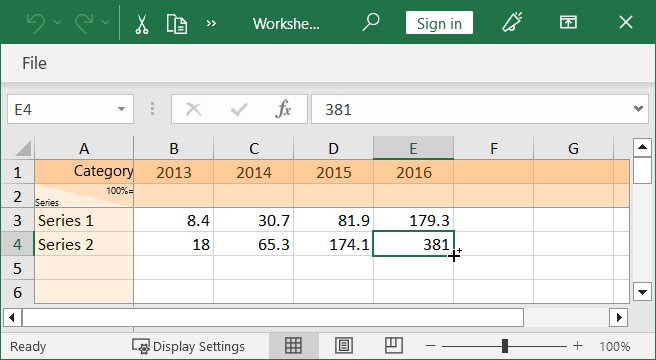
Note that the chart on the slide instantly updates to reflect the changes in the datasheet. It even grows and shrinks depending on the area of the datasheet that you use. Years are automatically inserted as category labels in the first row of the datasheet. The sequence of years is automatically continued when you start entering data in the following column.
Having entered the data, our example chart looks like this:
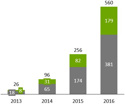
As you can see, think-cell has already performed a good deal of work to make the chart look “right.” In particular, it automatically placed all labels and added column totals. The next section explains the last few steps to finish our example chart.
4.4 Styling the chart
Every chart element consists of a number of features. In our example, text labels and column segments are the most important features of the column chart. Each kind of feature has a number of specific properties that you can change in order to give it a different look. To change a feature’s properties, you have to select it first. You can also select multiple features at a time to change their properties together.
Selecting features is very similar to selecting files in the Windows Explorer:
- Select a single feature by clicking on it with the left mouse button.
- Or select multiple features by holding down the Ctrl key while clicking.
- You can also select a contiguous range of features by holding down the Shift key, moving the mouse pointer and then clicking with the mouse. Watch how the affected features highlight while you move the mouse with the Shift key held down.
The following screenshot shows how all column segments of the second data series highlight in orange while they are collectively selected in a Shift-click operation:
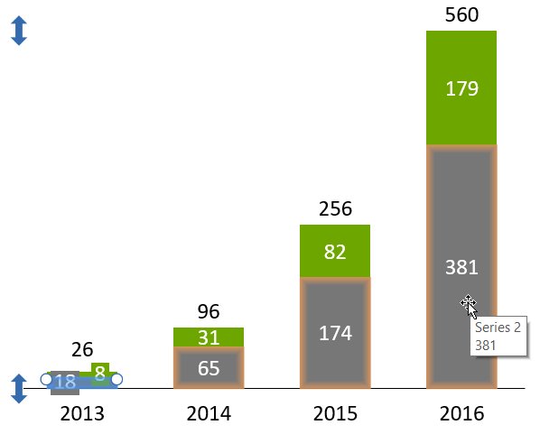
When you select features, a floating toolbar containing the corresponding property controls will appear. For the selection of column segments as illustrated above, for example, the Fill Color control becomes available in the toolbar:
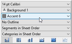
In our example, we want to change the shading of the second data series, as required by the scribble. Therefore, after selecting the column segments of the series, we choose Accent 6 shading:
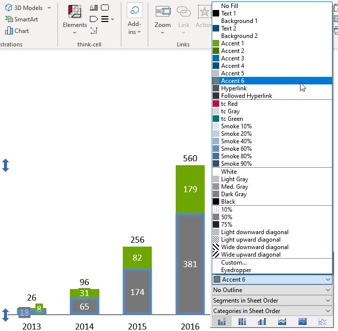
Note that the labels automatically turn white to make them easier to read on the dark background.
Finally, the numbers in our example chart are still displayed with incorrect precision. According to the scribble, they should be rendered with one decimal place precision. We simply have to select one of the segment labels, and the floating toolbar changes to include the Number Format control:
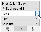
By typing the decimal place into the number format box, you can specify the desired display format and it will be applied to all numbers of the same type in the chart. Alternatively you can click on the arrow and select the desired format from the drop down box. Note that the actual numbers you type or select do not matter, they only act as an example of the required formatting (read more in section 6.5.3 Number format).
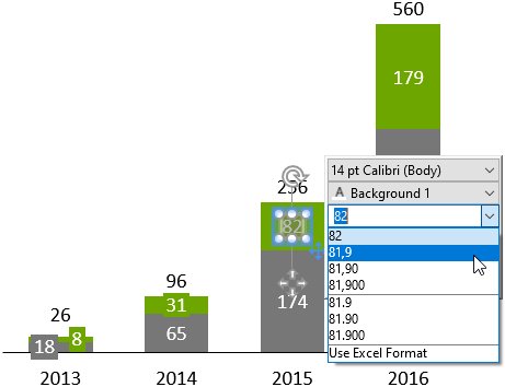
The scribble is now represented by a clear, professional looking chart. As you become familiar with using think-cell, you will be able to create a chart like this in less than one minute.
Charting
-
4.Introduction to charting
- 4.1
- Inserting a new chart
- 4.2
- Adding and removing labels
- 4.3
- Entering chart data
- 4.4
- Styling the chart
-
5.Data entry
-
6.Text labels
-
7.Column, line, and area chart
-
8.Chart decorations
-
9.Waterfall chart
-
10.Mekko chart
-
11.Pie and doughnut chart
-
12.Scatter chart and bubble chart
-
13.Gantt chart (timeline)
