10. Mekko chart
A Mekko chart (sometimes also called marimekko chart) is a two-dimensional stacked chart. In addition to the varying segment heights of a regular stacked chart, a Mekko chart also has varying column widths.
Column widths are scaled such that the total width matches the desired chart width. To preserve the visual relationship between widths of different columns, there are no gaps between columns in a Mekko chart.
In fact, the baseline of a Mekko chart is a fully fledged value axis. You can select it with the mouse, and you can use its context menu to add tick marks, tick mark labels and an axis title (see 8.1.1 Value axis). If you have enabled tick marks for the baseline, you can use the floating toolbar of the axis to switch between absolute and percentage values.
A Mekko chart can also be decorated with some of the features described in 8.1 Scales and axes and 8.2 Arrows and values. The labels of the Mekko chart support the label content property, which lets you choose whether you want to display absolute values, percentages, or both (6.5.5 Label content).
Contents
- 10.1
- Mekko chart with %-axis
- 10.2
- Mekko chart with units
- 10.3
- Ridge
- 10.4
- Other Series
10.1 Mekko chart with %-axis
|
Icon in Elements menu: |
|
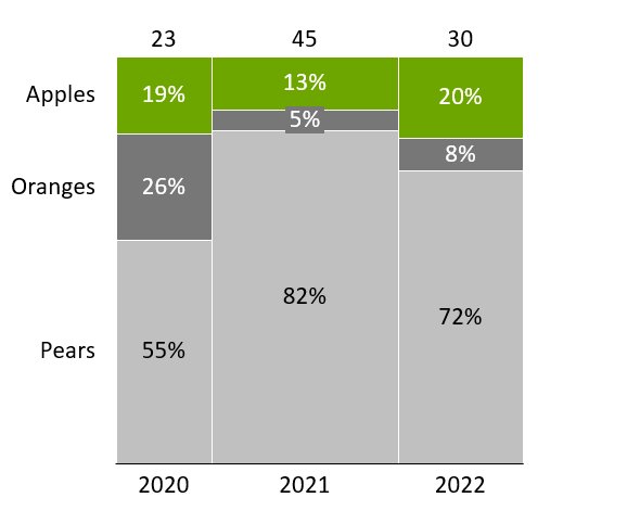
A Mekko chart with %-axis (sometimes also called marimekko chart or 100% cost curve) is a two-dimensional 100% chart. As in the 100% chart, the value axis is based on percentages and column heights are shown relative to 100%. In the regular 100% chart, since the columns are scaled to relative heights, there is no visual representation of absolute column totals.
The Mekko chart with %-axis extends the 100% chart and uses variable column widths to represent column totals. Thus, the segment area is proportional to the absolute value of the segments. As in the 100% chart, by default the datasheet takes percentages and the 100%-equivalent values are entered explicitly in the row labeled 100%=. As an example, the above Mekko chart is rendered from the following datasheet:
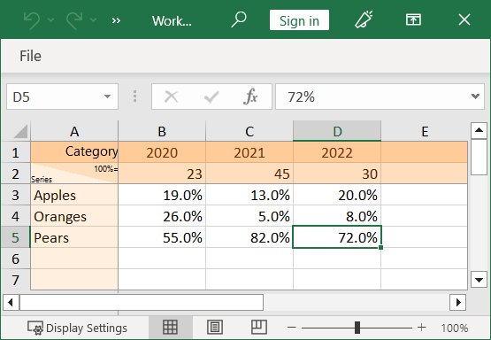
Alternatively, you can also enter absolute values into the datasheet. In this case, for all columns that add up to 100%, you can leave the 100%= row empty. For details about entering relative or absolute values refer to 5.2 Absolute and relative values.
10.2 Mekko chart with units
|
Icon in Elements menu: |
|
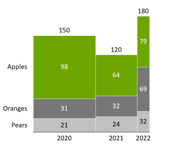
A Mekko chart with units (sometimes also called submarine chart or olympic chart) is a two-dimensional stacked chart. As in the regular stacked chart, the value axis and the datasheet of this chart are based on absolute values.
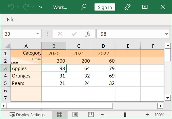
Width and height are controlled completely independently. Column widths are entered in the X extent row on top and individual segment heights are entered as in a regular stacked chart.
10.3 Ridge
|
In menu: |
Chart |
|
Menu item: |
|
You can highlight the outline of the Mekko chart: Click the 
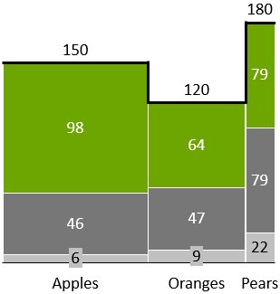
10.4 Other Series
You may want to combine several segments representing small portions of a category into one segment for “Other”. This way, an “Other” series is added to the chart, in particular when such a segment collecting smaller series is present for every category.
To create an Other Series, select all the segments that should be subsumed in it, right-click to invoke the context menu and choose 
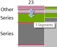
An Other Series can also be used in the stacked and 100% charts.
Charting
-
4.Introduction to charting
-
5.Data entry
-
6.Text labels
-
7.Column, line, and area chart
-
8.Chart decorations
-
9.Waterfall chart
-
10.Mekko chart
- 10.1
- Mekko chart with %-axis
- 10.2
- Mekko chart with units
- 10.3
- Ridge
- 10.4
- Other Series
-
11.Pie and doughnut chart
-
12.Scatter chart and bubble chart
-
13.Gantt chart (timeline)


